Airships and Oranges: The Commercial Art of the Second Gold Rush
How citrus crate label design fueled a boom that caused the art form’s own demise
/https://tf-cmsv2-smithsonianmag-media.s3.amazonaws.com/accounts/headshot/sarah-rich-240.jpg)
/https://tf-cmsv2-smithsonianmag-media.s3.amazonaws.com/filer/20120301031004airship470.jpg)
This series kicked off by looking at the marketing of the modern mandarin. Then we found out how science helped shape this popular fruit. Today we travel back to the time when citrus advertising was about more than selling produce—it was about cultivating California’s fantastical image and telegraphing it across thousands of miles.
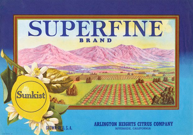
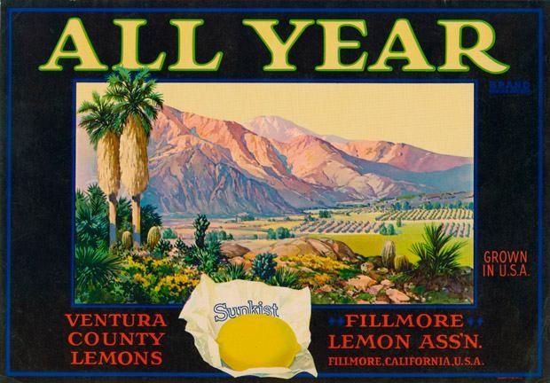
It’s no accident that the brilliant colors of citrus fruit—bright yellow, radiant orange, pink grapefruit—are also the hues used to depict dreamy California landscapes in graphic design and illustration going back centuries. The agriculture of the Pacific coast has long been a medium for communicating a sense of place and a way of life to people in far less fruitful climes.
At the end of the 19th century, when railroads had just begun hauling fresh food across the U.S., the labels that adorned produce crates delivered an invitation to the West. In his book Inventing the Dream: California Through the Progressive Era, historian Kevin Starr remarks, “A half century earlier the gold of California, reaching the East, had restructured the nation’s finances; now the nation’s diet—starchy, oleaginous, salty from the use of pickling as a primary mode of preservation—would be affected by California as well. An entire American generation would now encounter California in its urban or village markets as a crate of oranges.”
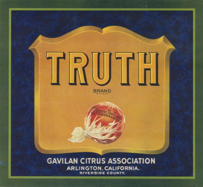
Sunkist was the earliest ambassador. Trademarked by the cooperative California Fruit Growers Exchange, Sunkist became a brand umbrella for hundreds of family farmers and small growers. Through developing the logo and graphic identity for Sunkist, the Growers Exchange “hit upon a cluster of advertising themes—health, domestic happiness, prosperity, respectability—that would eventually make the eating of a California orange or the drinking of a glass of California orange juice a ritual of proper American intent.” By 1914, Starr reports, “consumption of oranges by Americans had increased by 79.6 percent, from the next-to-no-oranges of 1885 to approximately forty oranges per American per year.” The citrus boom was California’s second gold rush.
As anyone who has seen a vintage fruit crate label (and who hasn’t?) already knows, this didn’t just happen because the advertisers were strategic, it happened because the artists were brilliant. But it’s rare to find an old label signed by the creator of the image. Most were designed anonymously by in-house teams at the printing presses where the labels were produced. The name that comes along most frequently when trying to trace the origins of this decades-long visual narrative is Max Schmidt.
Born in Germany, Schmidt immigrated to San Francisco in 1871 and opened his own print shop in 1872 in what is now the SOMA district of the city. He had an affinity for fine lettering, but no training to speak of. During his first year in San Francisco, he’d learned engraving while working in the printing department of the city’s early stock report newspaper, and honed his lithography skills creating labels at a cigar box manufacturer. When he opened Schmidt Lithography Company, wine labels were his first calling card. A biography published in the trade magazine The National Lithographer said of Schmidt, “Here was a genuine business, just getting under way when Max Schmidt launched out for himself. He grew and expanded as the Germans and the Italians up in the hills north of San Francisco harvested their grapes and pressed out the juice and bottled it. They needed labels for a product that was to take its place among the famous vintages of the world.”
But wine didn’t enjoy the same early growth trajectory as other California agriculture due to a combination of pest outbreaks, limited land area, and eventually prohibition. From the turn of the 20th century until the 1950s, fruit was the butter for Schmidt Litho’s bread.
Schmidt employed a team of artists and engravers who used limestone slabs and zinc plates (a process called zincography) to transfer original images onto label sheets. For each color, a new original had to be created. Aluminum presses and offset printing came later, and just as the tools for production evolved, so did the styles and themes of the labels. (An in-depth oral history, recounted by several life-long employees of Schmidt Lithograph and published in 1968, is available from the University of California at Berkeley.)
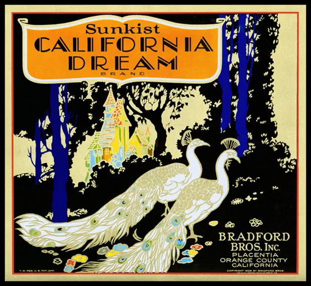
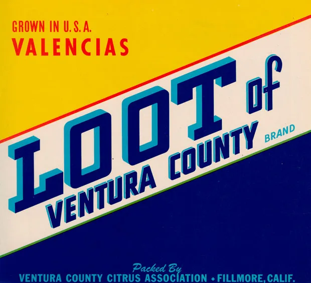
“We talk about an evolution of decorative and graphic art through three different periods,” says Kendra Dillard, who curated an exhibition of fruit crate art currently on view at the California State Railroad Museum in Sacramento. In the 1880s and 1890s, the labels were very flowery and detailed, featuring ornate, artistic flourishes. By the 1920s, art deco styles migrated up from Los Angeles. One of the few artists whose name is still associated with fruit label design, Archie Vasquez, used airbrush shading to emphasize the words that communicated the fruit’s provenance and quality grade. This was the era when billboards were becoming more ubiquitous, and a San Francisco-based artist named Othello Michetti pushed the lettering even further to the forefront, abandoning the more illustrative scenery and detail of earlier styles.
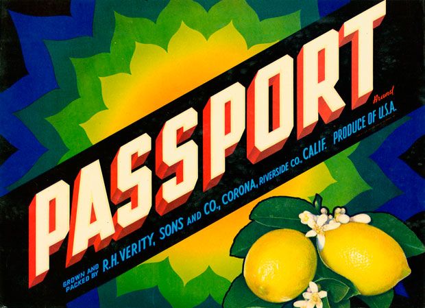
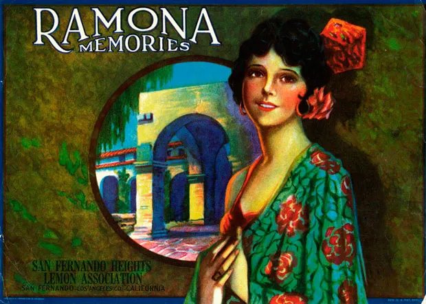
All along the way, the themes of crate label design were directed at “jobbers”—the middlemen who purchased wholesale fruit for the markets—more than grocery shoppers. Simply put, this translated to an advertisement targeting men. “Accordingly, throughout the late 1920s and 1930s, women – already popular label symbols – became increasingly seductive in image in an obvious play to attract male buyers at East Coast auctions.”
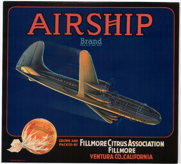
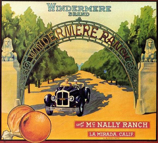
Even more often, the labels showcased the most recent advances in transportation—which not only supplied a sexy image, but also signified the acceleration of the industry’s distribution networks. In early ads from Ventura, California-based Airship brand oranges, a bulbous zeppelin flies over a hazy agricultural expanse. But when planes became a viable mode of moving goods, the Airship label featured a turboprop diving swiftly against a flat blue sky. In the 1910s, Windermere Ranch advertised their oranges with a horse-drawn carriage; but by the 1920s, a black roadster cut across the groves.
Then in the 1950s, another innovation shut off this vein of American folk design. The development of wax-coated cardboard eliminated the need for wooden fruit crates, and with it, the need for paper labels. In addition, the label’s promise of California as a dream destination had worked almost too well. As Laurie Gordon and John Salkin note in a 1977 article in the California Historical Quarterly, “After the war, fifty years of ‘selling California’ resulted in the massive redevelopment of the southland never anticipated in the early years of the promotion of ‘orange gold.’…The fantasy of the fruited plain transformed into a suburban vision, and new housing spread across the fields that were once covered in citrus.”
Packing houses abandoned and burned tens of thousands of unused labels, but many thousands more remain (put the search term into Etsy and you’ll be occupied for hours). While the artists behind them are sadly unidentifiable in the historical record, the art itself has become one of the most colorful threads we have to trace nearly a century of California culture.
Follow @sarahrich
Follow @smithsonianmag
/https://tf-cmsv2-smithsonianmag-media.s3.amazonaws.com/accounts/headshot/sarah-rich-240.jpg)