
Crimilda Pontes: The Original Designer of the Smithsonian Sunburst
A celebration of the woman who originally designed the iconic Smithsonian sunburst.
:focal(843x346:844x347)/https://tf-cmsv2-smithsonianmag-media.s3.amazonaws.com/blogging/featured/03_Crimilda_in_Cap_and_Gown.JPG)
You probably recognize the Smithsonian’s sunburst seal, but we think you should get to know the woman behind it. Meet designer Crimilda Pontes.
Recently, we were digging through a box of graphic design files and typewritten memos from the 1980s at the Smithsonian Institution Archives when we made an exciting discovery. We were originally in search of historical designs needed for an upcoming event (note: we are event planners, not historians), but came across some amazing clues that uncovered a part of Smithsonian history that had been buried for over fifty-five years.
As we opened the last file folder in the storage box, we were faced with a translucent annotated paper from 1965 filled with finely executed graphite drawings. These designs were logo ideas for the 1965 James Smithson Bicentennial Celebration, and there, among the drawings, was the now-familiar Smithsonian sunburst. Alongside the symbol was a typewritten note:
As a good graphic design, the sun seemed not only appropriate for its scientific element, but as a symbol for enlightenment to the whole world—and less hackneyed than the usual torch. It is also an important element in the Smithson arms and crest.
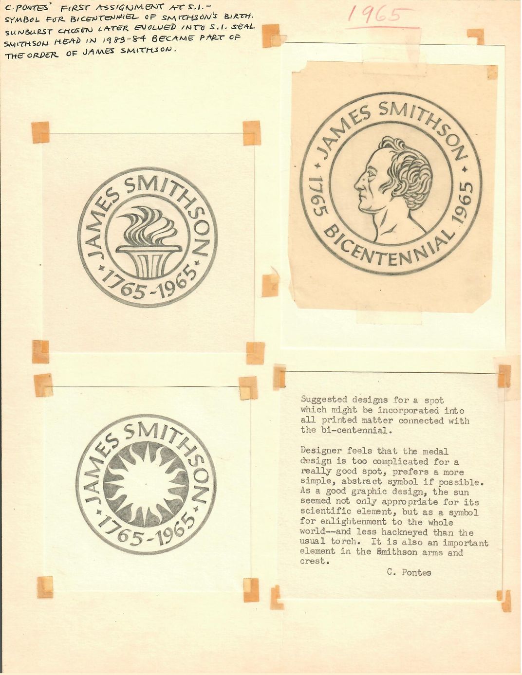
C. Pontes
My colleague and I turned to each other. Had we just, by chance, come across the first drawing of the Smithsonian logo?
A quick look into the Smithsonian brand guidelines had no further information on the logo’s designer or history. The guidelines simply state that the “Smithsonian seal, since its 1966 unveiling, has been an apt symbol of our mission, ‘the increase and diffusion of knowledge,’ a tenet of the Enlightenment era embraced by our benefactor, the English scientist James Smithson.” It continues, “This symbol was fully embraced by the late Ivan Chermayeff, the renowned graphic designer who developed our comprehensive logo system in the late 1990s.”
So who was C. Pontes? The original designer of the Smithsonian’s recognizable sunburst logo?
Crimilda Pontes was the Smithsonian’s first official graphic designer hired by Secretary S. Dillon Ripley in 1965. Pontes received her MA in graphic arts from Yale University in 1959 and designed books and book jackets for the Yale University Press until 1964. Ripley knew Pontes from his time at Yale, so when he was appointed Secretary, he invited Pontes to bring her artistic talents to the Smithsonian. And there she stayed for twenty-three years until her retirement in 1988. According to Smithsonian historian Pam Henson most anything designed for the Institution between the years 1965 and 1988 can likely be credited to Pontes.

After having now looked through many boxes of her files, we know that Pontes often went back and reflectively annotated her documents before they were filed and archived. Looking more closely at this sheet of drawings from 1965, you will see that Pontes has done the same here. At the top of the page she writes:
C. Pontes’ first assignment at SI—symbol for bicentennial of Smithson’s birth. Sunburst chosen later evolved into S.I. seal.
Here, Pontes makes sure this piece of Smithsonian design history is remembered. We are honored to now share Pontes’ story and acknowledge her contributions to the Smithsonian, especially as the original designer of the Smithsonian’s iconic sunburst symbol.
With thanks to Western Michigan University Libraries for updating the Crimilda Pontes Graphic Arts Archive collection record with this information and for their support of our research.
Everything you read about in IMPACT is made possible in part thanks to support from lifelong learners like you. Donate today and power Smithsonian's mission to create and share knowledge with everyone, everywhere.
Want more stories about how the Smithsonian impacts your world? Join our community of curious, passionate knowledge-seekers from across the globe.