Could Our Housewares Keep Us Healthier?
Some designers are harnessing sound, color, smell and touch in products that promote well-being and independence for all
/https://tf-cmsv2-smithsonianmag-media.s3.amazonaws.com/accounts/headshot/SusannahGardiner.JPG)
/https://tf-cmsv2-smithsonianmag-media.s3.amazonaws.com/filer/a3/ff/a3ff7fcd-6935-4111-99d3-fff6a897ff56/55946.jpg)
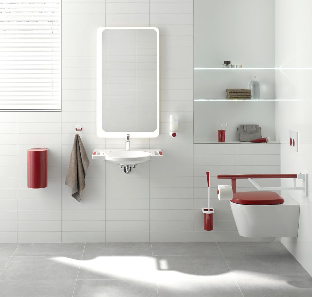
Red gets attention. It’s the color of stop signs, fire engines, nail polish and Prince’s little Corvette. Some evidence suggests that our ability to see red stays with us longer than other colors: For people with dementia, it can be difficult to distinguish between hues, but red seems to fade out later than blues or greens.
And so, when the German company Hewi designed a bathroom for people with memory loss, it relied on red. The Dementia Care Bathroom has fixtures highlighted in red on a white background. The bright red draws attention to only those parts that a user needs to touch: the pump on the soap dispenser, the flush buttons above the toilet and especially, in case of a fall, the grab bars.
“I always think of color as being this kind of extra. It’s pretty,” says Ellen Lupton, curator of contemporary design at the Cooper Hewitt, Smithsonian Design Museum. But here, color serves a purpose.
Hundreds of thousands of Americans get hurt in bathrooms, most of them by falling. Brightly colored fixtures can make the bathroom easier to navigate, and quite possibly safer, not just for dementia patients but for anyone who’s less than fully alert in the morning. Color, Lupton says, becomes “something that’s cognitive and functional.”
Hewi’s bathroom fixtures appear in an imaginative exhibition at the Cooper Hewitt organized by Lupton and Andrea Lipps, assistant curator of contemporary design. Called “The Senses: Design Beyond Vision,” the show explores how our senses feed off and reinforce one another, conveying critical information and sending signals we’re not aware we’re picking up. With such playful and touchable projects as a fountain of feathers, or a furry wall that plays music when visitors rub against it, the show is unusually tactile and interactive. But many of the objects also have potential applications that bring in smell, sound, taste and touch, as well as sight, in ways that could keep us healthier or make our surroundings work better for everyone.
The noisy soundtrack of a hospital, for example, includes innumerable buzzing and beeping medical monitors; in one study, researchers counted almost 200 alarms per bed per day, many of them false. For patients, alarms disrupt sleep, cause stress and can harm their health in other ways. For staff, “alarm fatigue,” or becoming desensitized to the clash of noises, can lead to missing important alerts, with sometimes dreadful consequences.
Alarm fatique by Man Made Music takes aim at that problem with a model of what future medical monitoring could sound like. It is based on a prototype technology that would convert streams of a patient’s data—such as heart rate, blood pressure and blood oxygen levels—into a harmonious set of notes, chirps and tones. The idea is to “make the sound much more useful to caregivers and much less scary to patients,” says Man Made Music’s founder Joel Beckerman, a composer and sonic branding specialist who developed the technology along with composer Joel Douek.
Current hospital devices, Beckerman says, “speak different languages,” emitting multiple unique tones; it adds up to an overwhelming number of separate sounds for hospital staff to keep track of. By using the properties of music, the sounds Douek and Beckerman envision in Alarm Fatigue could convey more information to caregivers, and in a form that would be easier to grasp—plus more pleasant—than a jangle of unrelated beeps. Then, against a calmer and more coherent backdrop, an emergency alert would stand out “even if it’s not shrieking,” Beckerman says. Alarms wouldn’t have to be so alarming.
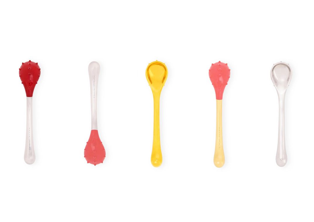
“The Senses” includes products and prototypes that use sensory design to encourage healthy behaviors at home. Take eating. On the whole, Americans do too much of it. Often we don’t really notice what or how much we’re consuming, in what Lipps calls “our rote behaviors—insert food, chew, swallow.” What if utensils encouraged eaters to slow down and pay attention? Designer Jinhyun Jeon created a collection of highly textured spoons in plastic, wood and other materials chosen as much for the way they sound and feel in the mouth as for their looks. It’s impossible to imagine mindlessly shoveling down a meal with these bumpy, curvaceous food toys.
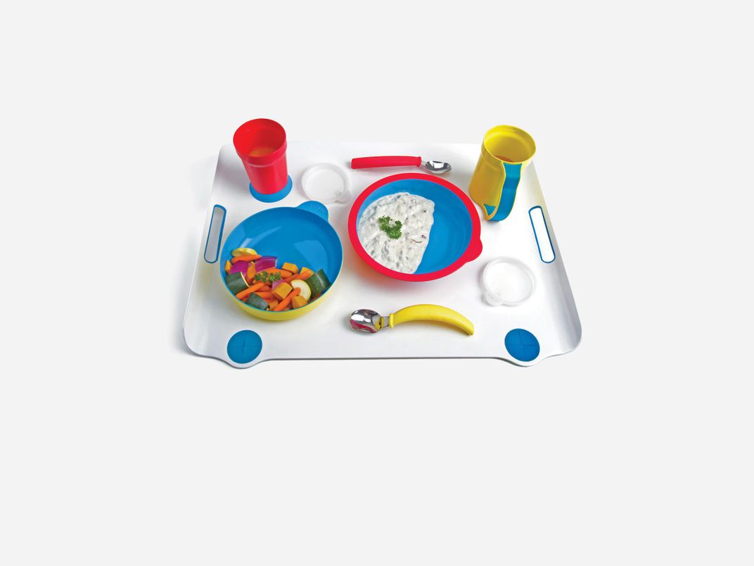
For elderly people with dementia, though, it’s sometimes hard to eat enough. Deficits in memory and visual perception make it hard to see the food on the plate: white rice blends into white plate, which blends into white tabletop. Sha Yao’s Eatwell Assistive Tableware uses a vivid blue for the insides of dishes, because it contrasts with many foods, and because some studies have found that brightly colored plates encourage Alzheimer’s patients to eat more. Loss of appetite can also be a problem.
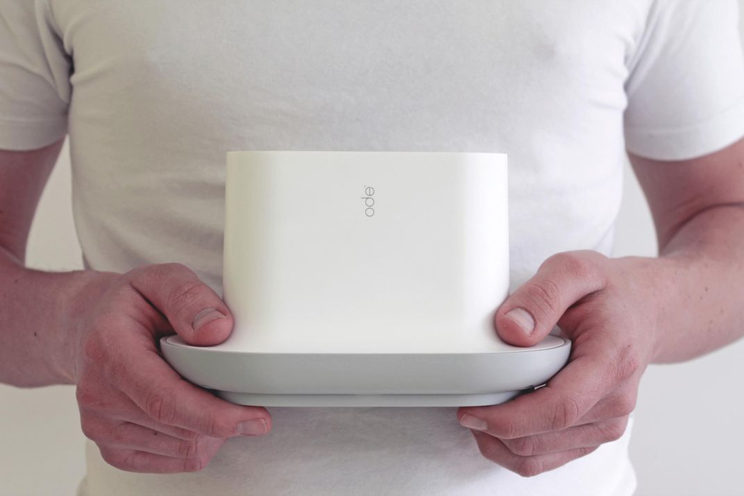
“If you’re living in a facility where you’re not close to the kitchen, food can become more abstract, and not really a part of your day,” Lupton says. People miss out on the sensory cues that announce mealtime—the clattering of pots and the aromas of food on the stove. So Rodd Design’s Ode scent player wafts different scents to stimulate appetite before each meal: maybe grapefruit in the morning, pizza at lunchtime and chocolate cake at dinner. Sensory tools can promote eating as much as suppress it.
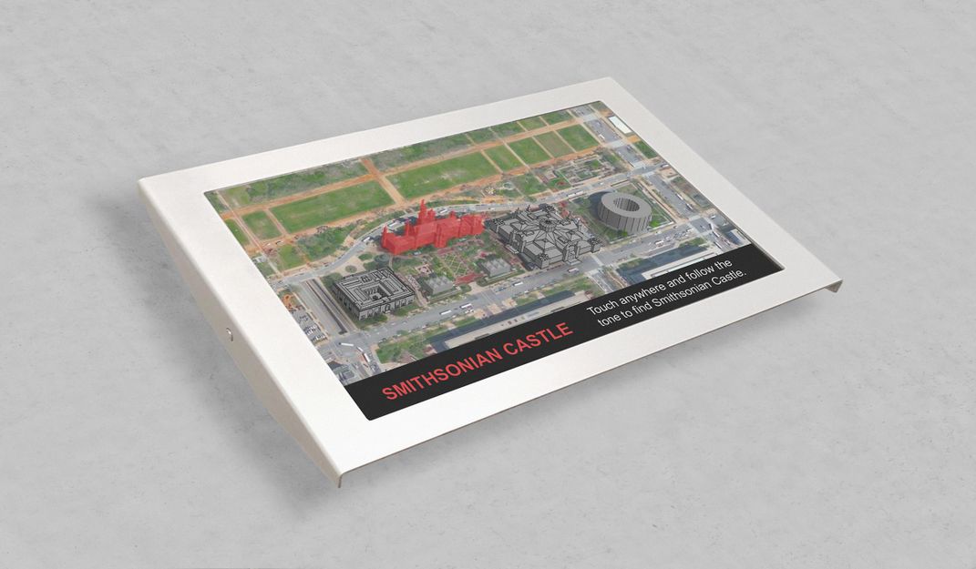
Design that engages multiple senses also makes it easier for people with limited sight or hearing to navigate the world. Steven Landau’s prototype for an audio-tactile map of the Smithsonian museums in Washington, D.C., presents information in a touch screen, audio text and 3D bronze models of the buildings. It’s intuitive and inviting to all. Operating, as Lupton says, on “multiple pathways and simultaneous pathways,” it’s accessible to people with hearing or visual impairments, as well as children or anyone who learns better by touching or listening than by reading. Inclusive design like this lets people of many abilities use a product together, Lupton says. “It can be frustrating to have to ask for special assistance,” she says, “when a simple design change would make it accessible to all.”
In the same vein, Leaven is a set of prototype kitchen wares designed by Simon Kinneir, who is partially sighted in one eye. His pieces use tactile feedback and color contrast to give “reassurance” in the kitchen to people who are blind or have low vision, Lupton says. A white cutting board is scored with black grooves, and a mug has an indentation for your thumb; the thinner material there allows you to feel a temperature change as you pour hot coffee. That sensory feedback is satisfying for any user, Lupton says, adding that the mug is “very attractive, physically and visually.”

All of us have different sensory abilities and inclinations, and they change over the course of our lives. “The best design includes many different users, from a child to an older person to someone with difficulty walking or standing,” Lupton says. “When a potato peeler or a smartphone is designed for inclusion, it brings pleasure and functionality to a broader audience.” Products and technologies that draw on multiple senses might keep us healthier, happier or more connected to the world around us. Lupton says, “All design should be accessible, and all design should be sensory.”
“The Senses: Design Beyond Vision” is on view in New York City at the Cooper Hewitt, Smithsonian Design Museum, through October 28.
/https://tf-cmsv2-smithsonianmag-media.s3.amazonaws.com/accounts/headshot/SusannahGardiner.JPG)