Stunning Map Shows Changes in Light at Night Around the World
The satellite images show where the most light is making night skies bright
/https://tf-cmsv2-smithsonianmag-media.s3.amazonaws.com/filer/e2/78/e2781fe9-b7e7-48ed-99d9-5644c78b2714/screen_shot_2017-05-02_at_122810_pm.png)
/https://tf-cmsv2-smithsonianmag-media.s3.amazonaws.com/filer/a8/4a/a84a3a4d-4aa5-4114-872a-e6d6c8f0272a/screen_shot_2017-05-02_at_122733_pm.png)
/https://tf-cmsv2-smithsonianmag-media.s3.amazonaws.com/filer/bf/cd/bfcd67e6-93c3-428b-98be-ae25f11e8ccd/screen_shot_2017-05-02_at_123659_pm.png)
/https://tf-cmsv2-smithsonianmag-media.s3.amazonaws.com/filer/f7/2a/f72ae97c-c4b2-4fbf-ab60-b81d01bfd696/screen_shot_2017-05-02_at_123254_pm.png)
/https://tf-cmsv2-smithsonianmag-media.s3.amazonaws.com/filer/31/d7/31d74800-e207-4d0d-bb8e-11a86184e379/screen_shot_2017-05-02_at_122515_pm.png)
/https://tf-cmsv2-smithsonianmag-media.s3.amazonaws.com/filer/ed/c7/edc7558d-2fc0-4f53-aa0c-fba2576a48d9/screen_shot_2017-05-02_at_122536_pm.png)
Last month, NASA released two global maps of the Earth at night—one taken in 2016, the other a revised version of a 2012 map. The satellite images showed our planet twinkling under the night sky, with constellations of light stretching across vast territories. To pinpoint shifts in light patterns, cartographer John Nelson recently consolidated the two maps into a single image, Betsy Mason reports for National Geographic. His project, titled “Lights On Lights Off,” paints a fascinating—and in some places worrisome—picture of a changing world.
Nelson, a cartographer at the analytical mapping company Esri, came up with the idea for the project while he was toggling between the Black Marble maps, as NASA’s images are called. The maps are composites created by code that picked the “clearest night views” during 2012 and 2016, according to a NASA press release.
“I was swiping back and forth ... and was fascinated by where things had changed,” Nelson told Mason. “So I thought a change-detection map would let me see that really easily, in one go.”
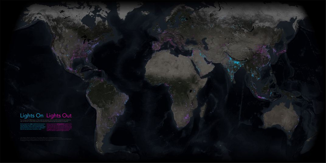
As Linda Poon reports for City Lab, Nelson overlaid the two maps by feeding NASA’s data into ArcGis, Ersi’s mapping and analytics software. The software relies on “a simple pixel-difference math bot,” Nelson explains on his blog, which allowed him to highlight new light in blue, extinguished light in pink. Places that did not change—either because they never had much in the way of artificial light, or because they remained consistently bright—were left transparent.
In an accompanying story map, Nelson highlights some of the more striking changes he observed. Blue light proliferates across India on Nelson’s map, for instance. The country has indeed become markedly brighter over the course of four years, thanks to an ongoing electrification program that seeks to bring electricity to rural areas. The Indian government says that over 4,000 villages need to be electrified, according to Poon; that number may be even higher. But Nelson’s map suggests that significant progress has been made in spreading light to rural villages.
Syria, on the other hand, is crested with pink on Nelson’s map. Since the start of the Syrian civil war, once-thriving urban centers have been destroyed and millions of civilians have fled the country, leaving behind regions of dark.
Night-time lighting has also dimmed in Venezuela and Puerto Rico, though for markedly different reasons. A crippling economic recession in Venezuela has prompted the government to ration electricity. Puerto Rico, by contrast, has been trying to curb light pollution, even launching a special government Task Force to tackle the issue, Poon writes.
Nelson’s maps can’t give us all the answers. It isn’t clear, for instance, why the American state of Georgia is getting brighter while the Carolinas have darkened. And brighter regions don’t necessarily indicate a spike in electrification. “[I]t could also mean a change in the type of streetlights being used,” NASA earth scientist Miguel Román told National Geographic’s Mason.
But maps like Nelson’s can identify areas worthy of further investigation, where changes in human activity may be reflected in the night sky.