In Step With Income Inequality, US Cities More Geographically Segregated than Ever
Residential segregation has increased by income in 27 out of 30 of America’s metropolises, and in some cases translates to shorter lives in poorer areas
/https://tf-cmsv2-smithsonianmag-media.s3.amazonaws.com/accounts/headshot/Rachel-Nuwer-240.jpg)
/https://tf-cmsv2-smithsonianmag-media.s3.amazonaws.com/filer/20120803114008chicago.jpg)
Residential segregation has increased by income in 27 out of 30 of America’s major metropolises, according to an analysis conducted by the Pew Research Center.
The analysis finds that 28% of lower-income households in 2010 were located in a majority lower-income census tract, up from 23% in 1980, and that 18% of upper- income households were located in a majority upper-income census tract, up from 9% in 1980.
At the same time, middle income neighborhoods across the U.S. shrank as income inequalities grew.
Despite these trends, neighborhood segregation by income did not outpace that of race segregation, which remains one of the most pervasive residential segregation determinants.
Of all segregated U.S. cities, it’s likely that Chicago reigns supreme, and those differences translate into life and death inequalities.
As The Atlantic highlights a new report by the Joint Center for Political and Economic Studies, which found that people living in Chicago neighborhoods with a median annual income higher than $53,000 have a life expectancy almost 14 years longer than those living in Chicago communities with average median incomes below $25,000. In Chicago, those with the lowest income are also minorities. The city’s historic segregation of income and race thus serve as proxies for health outcomes in life.
This research reinforces an idea we’ve written about previously: that where you live may be the most important determinant of your health.
Here are a couple maps included in the study that show Chicago’s racial and income disparities:
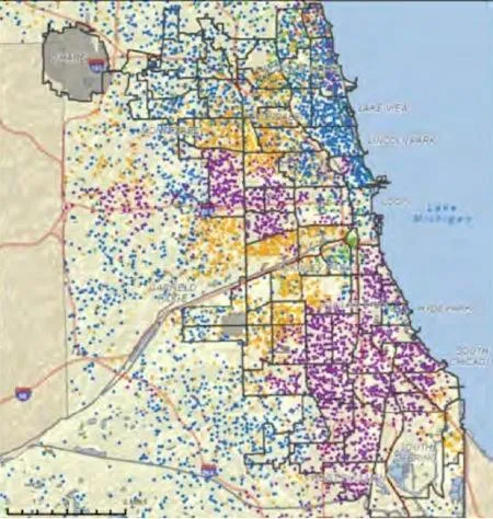
As detailed in The Atlantic, each blue dot represents 500 whites (as captured in the America Community Survey between 2005-2009), while each purple dot the same number of blacks. Yellow represents the city’s Hispanics and green the Asian population (that green concentration right in the middle of the city is Chinatown).
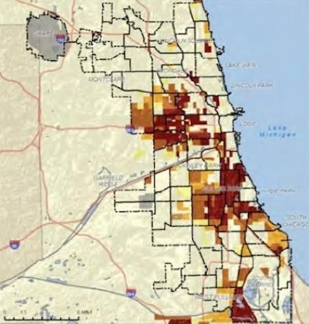
This map depicts poverty in Chicago, with the darker patches represent worse poverty.
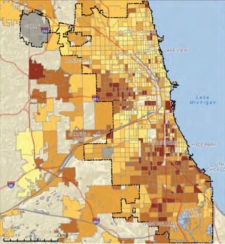
Putting it all together, we have a map of life expectancy in Chicago, with the darkest areas covering residents not expected to live past 70.
More from Smithsonian.com:
/https://tf-cmsv2-smithsonianmag-media.s3.amazonaws.com/accounts/headshot/Rachel-Nuwer-240.jpg)