Transforming Raw Scientific Data Into Sculpture and Song
Artist Nathalie Miebach uses meteorological data to create 3D woven works of art and playable musical scores
![]()
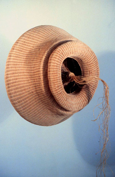
For Nathalie Miebach, the stars aligned with this sculpture, inspired by a Hertzsprung-Russell diagram. © Nathalie Miebach
In 2000, Nathalie Miebach was studying both astronomy and basket weaving at the Harvard Extension School in Cambridge, Massachusetts. She was constantly lugging her shears and clamps with her into the room where she’d study projections of stars and nebulas on the wall.
Understanding the science of space could be tricky, she found. “What was so frustrating to me, as a very kinesthetic learner, is that astronomy is so incredibly fascinating, but there’s nothing really tactile about it,” says Miebach. “You can’t go out and touch a star.”
Soon, something in the budding artist clicked. Her solution? Turn space data into visual art, so that she and other learners like her could grasp it.
Miebach’s final project for her basket weaving class was a sculpture based on the Hertzsprung-Russell diagram, a well-known astronomy scatter plot measuring stars’ luminosities against their surface temperatures. Temperature readings travel downward from left to right, and the wider the diameter of the star, the higher the luminosity. The graph is used to track stars as they evolve, showing how they move along the diagram as shifts in their structure cause changes in temperature, size and luminosity.
Miebach translated the relationship between star luminosity and temperature into a thick, funnel-shaped sculpture (shown above) with tightly interwoven reeds. She uses the temperature and luminosity values of specific stars on the diagram to inform the manner in which she weaves the reeds.
Basket weaving involves a three-dimensional grid with vertical spokes that create structure and horizontal weavers that fill in the sides of the work. The sculpture achieves its shape through the interaction of the materials—usually, straw, grass or reeds—and the amount of pressure exerted on the grid by the artist’s hand.
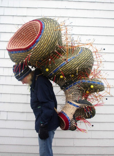
“Antarctic Explorer – Darkness to Lightness” © Nathalie Miebach
Miebach’s next project involved transforming scientific data of solar and lunar cycles into sculpture. In the piece pictured above, the artist transferred three months of moon, twilight and sun data from Antarctica into layers of woven reeds. She assigned the vertical and horizontal reeds of the basket grid specific variables, such as temperature, wind and barometric pressure. Changes in these variables naturally altered the tension exerted on the reeds, and the varying tensions created bulges within the piece. The changing values of these variables distorted the tension between the reeds, driving the warped shapes that emerged in the piece.
Reeds are not unbreakable; if too much pressure is exerted, they snap. If Miebach used wire, she’d be completely in charge of the process, and no tension would exist to guide the piece into its final shape.
“Because these cycles change every day, you are working this grid in different ways,” she says.
The thick, ribbon-like blue lines circumventing each bulge are segmented into hours of the day. The naturally colored reeds representmoon data, the yellow reeds sun data and the green reeds twilight.
The yellow spheres on the exterior of the shape signify sunrise and the smaller navy balls represent moon phases. The orange spokes protruding from each bulge of the sculpture represent solar azimuth, or the spherical angle of the sun, and solar hours, which measure the passage of time based on the sun’s position in the sky. Red spokes designate the ocean’s high tide and yellow spokes, the low tide. The basket grid becomes a pattern representing the changes of these variables.
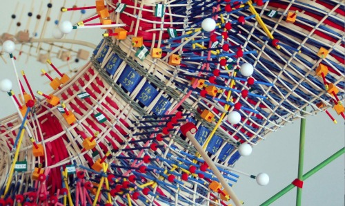
How elements like wind, temperature and barometric pressure, assigned to vertical spokes based on values from low to high, look in a woven representation of two months of Cape Cod weather. © Nathalie Miebach
This weaving process remained the same when Miebach’s subject changed from sky to sea during an artist residence on Cape Cod several years ago. Armed with basic measuring tools like thermometers purchased at the hardware store, Miebach studied the Gulf of Maine every day for 18 months, checking and recording temperature, wind speeds, barometric pressure and other climate indicators. She gleaned additional data from weather stations, satellites and anchored buoys bobbing up and down in open water.
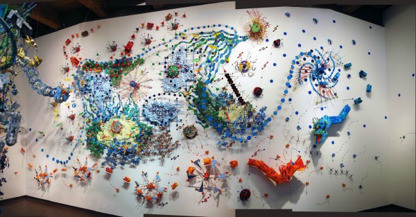
“Changing Waters” portrays meteorological and oceanic interactions within the Gulf of Maine. © Nathalie Miebach
The result was multiple woven sculptures examining different aspects of the Gulf of Maine. A 33-foot-wide wall installation called “Changing Waters” (pictured above) depicts the geography of the gulf. The blue material represents its currents, streams and basins, delineated by changes in the water that Miebach recorded and assigned to each tiny segment.
“To Hear an Ocean in a Whisper” (pictured below) examines the effects of currents, temperature and tidal patterns on krill living in the Georges Bank of the Gulf of Maine. The roller coaster represents the Labrador Current, which flows from the Arctic Ocean and along Nova Scotia’s eastern coast. The merry-go-round inside shows how krill activity changes as temperature, salinity and wave height vary, and the Ferris wheel tracks the diurnal cycle of the tiny crustaceans. A swinging ship-style ride follows the tidal patterns of the Bay of Fundy on the northeast end of the gulf and nearby whale sightings.
“Everything is some sort of data point,” Miebach says. “There’s nothing there just for whimsy or aesthetic purpose only.”
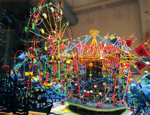
“To Hear an Ocean in a Whisper.” © Nathalie Miebach
The artist has taken this same approach with her latest project: translating scientific data into musical scores. When Miebach relocated from the coast of Maine to Omaha and then Boston in 2006, she realized the cityscape influenced weather dramatically, and not in the same way that the shoreline did.
“In an urban environment, you have infrastructure, you have heat bubbles that hover over cities, you have the lack of vegetation, and all these create very localized fluctuations in weather data that the weather instruments are very sensitive in picking up,” she says.
Miebach found that she could not accurately express in her basket weaving the subtle fluctuations in weather that cities foster. Instead, she began experimenting with musical notation as a medium, which she says provided the flexibility she needed in artistically representing weather data at the street level.
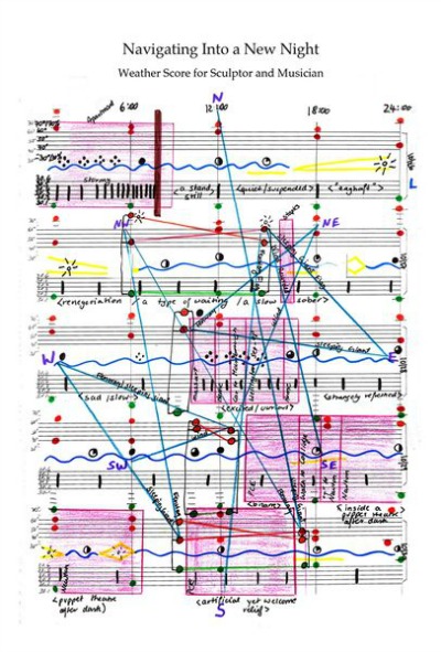
“Navigating Into a New Night” © Nathalie Miebach
In the score pictured above, the royal blue squiggly lines represent cloud cover. The notes signify weather variables: orange is humidity, red is temperature and green is barometric pressure. The sky blue lines zigzagging across the sheet indicate wind direction, and the pink shading represents tempo for musicians to interpret.
Interpreting scientific data in this way allowed Miebach to translate the nuance of weather she felt was present in a city environment without altering the information in any way. “One thing that has been very dear to my heart from the very beginning is that I don’t change information for any aesthetic purpose,” she says. “I want the information to stay true, so that when you look at the sculpture, you’re still seeing the weather.”
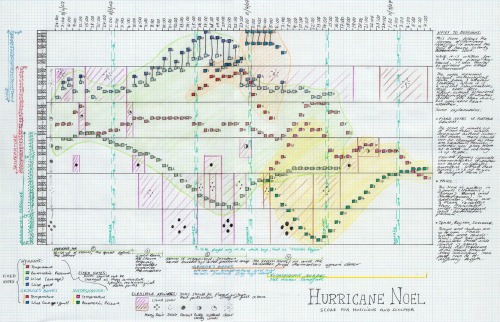
Musical score for Hurricane Noel. © Nathalie Miebach
In her musical score for Hurricane Noel, which swept along the Atlantic Ocean in 2007, Miebach correlated each change in a given weather variable she had measured with a note on the piano keyboard. The piano scale is drawn as black-and-white column on the left-hand side of the sheet music (pictured above). Shaded regions represent shifting cloud cover during the storm.
Miebach says she transposed wind speed into the upper two octaves because howling winds are a dominant aspect of any storm. Each note on the scale receives a range, from zero to two miles per hour, two to four miles per hour and so on. The same goes for temperature and barometric pressure readings.
The Nineteen Thirteen, a group of cellists and percussionists, performed Hurricane Noel at the Milwaukee Art Museum in 2011 (listen to the ominous-sounding song here). Another cellist group offered up a different interpretation.
But transforming the musical scores into live performances isn’t the end. Once she feels that she has captured the nuances of weather data from urban settings, Miebach then uses her melodious blueprints to create woven sculptures such as the one pictured below.
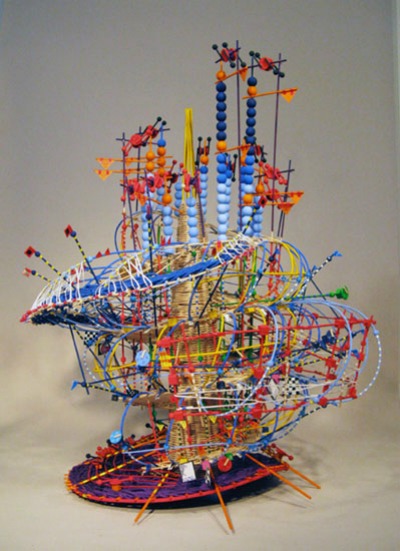
What Hurricane Noel looks like in three-dimensional music. © Nathalie Miebach
The amusement-park themed “To Hear an Ocean in a Whisper” that Miebach made in collaboration with Jon Fincke, an oceanography graduate student at MIT, is on display in “Ocean Stories: A Synergy of Art and Science,” an exhibition at Boston’s Museum of Science through June 2. Her latest piece, “The Last Ride,” translates weather and ocean data from Hurricane Sandy, which destroyed the Jersey Shore’s Star Jet roller coaster. It will be featured in the Massachusetts College of Art and Design’s annual art auction on April 13.
/https://tf-cmsv2-smithsonianmag-media.s3.amazonaws.com/accounts/headshot/marina-koren-240.jpg)
/https://tf-cmsv2-smithsonianmag-media.s3.amazonaws.com/accounts/headshot/marina-koren-240.jpg)