Sans Forgetica is the Typeface You Won’t Forget
This “memory-boosting” font is stylized with a left-leaning slant and gaps in each letter meant to encourage your eyes to linger longer
/https://tf-cmsv2-smithsonianmag-media.s3.amazonaws.com/accounts/headshot/10172852_10152012979290896_320129237_n.jpg)
Sometimes, character flaws can make a person—or a thing—all the more memorable. Such may be the case with Sans Forgetica, a new gap-ridden typeface released (for free) last week by researchers at RMIT University in Melbourne, Australia.
According to an RMIT press release, this font is the first specifically designed to help its readers retain more information—a potential perk for students cramming for exams, for instance. The typeface was born out of a multidisciplinary research effort that combined the skill sets of design specialists, psychologists and more.
“This cross-pollination of thinking has led to the creation of a new font that is fundamentally different from all [others],” Stephen Banham, a typography expert at RMIT, says in the press release.
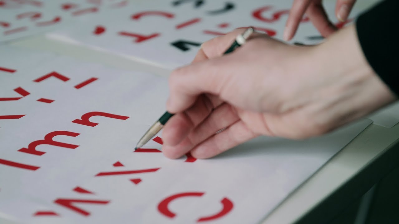
And Sans Forgetica—with its cheeky, literal name—is indeed pretty memorable. Entire hunks of each character are left off the page, giving them a slightly disjointed or haphazard appearance. The font also back-slants, or leans to the left (the opposite direction of italics, which tilt rightward)—something typically used only in cartography when indicating rivers, reports Taylor Telford at The Washington Post.
These unique characteristics, which fly in the face of conventional text, make readers think twice about what’s in front of them. “We've actually subverted… conventional reading patterns,” explains Banham, in an interview with Scott Simon at NPR.
Such a meticulous strategy adheres to the psychological principle of “desirable difficulty,” increasing the effort that readers have to put into understanding text, which helps solidify the material at hand in memory, according to the RMIT press release. For instance, to fill in the gaps in each character, the brain is forced to pause and puzzle out the pieces.
“[Sans Forgetica] kind of plays a slight trick on the mind... so that actually slows down the process of reading inside your brain,” Banham tells Simon. More typical fonts are simply too familiar, making it all too easy to skim and forget.
The researchers were careful not to tread too far into the realm of the wacky, however; certain fonts are so wonky-looking that they’re “virtually impossible to read,” Banham explains in his NPR interview. Sans Forgetica, on the other hand, intentionally dwells in a bit of a legible “sweet spot.”
But the team didn’t just take these attributes at type-face value. Recruiting about 400 Australian students, they conducted an online experiment to test the memory-boosting power of several different fonts. When participants read text in plain Arial, they remembered about half of it. But Sans Forgetica readers came recalled about 57 percent of their material, The Guardian reports.
As for adopting Sans Forgetica universally? Forget about it. As Banham tells Simon, reading a novel in Sans Forgetica would be an efficient way to bring on a migraine.
Instead, Banham sees his typeface as a tool for the studious to highlight specific passages or key phrases, only in a “very, very selective manner,” he says to Simon. According to The Guardian, Janneke Blijlevens of RMIT’s Behavioral Business Lab adds foreign language learners and elderly people grappling with memory loss to the list of potential beneficiaries.
You can test it out yourself by downloading it here, but heed the warnings and use it sparingly. After all, part of Sans Forgetica’s charm is its atypical nature.
/https://tf-cmsv2-smithsonianmag-media.s3.amazonaws.com/accounts/headshot/10172852_10152012979290896_320129237_n.jpg)