The Sleek History of Airline Maps
A new book explores the evolution of cartography throughout more than a century of commercial air travel
/https://tf-cmsv2-smithsonianmag-media.s3.amazonaws.com/filer/a6/70/a67039df-5e83-4f26-852a-fc4ab1970a7c/1962_airindia_pink_max.jpg)
On January 1, 1914, the first scheduled passenger flights began soaring through the skies between St. Petersburg and Tampa, Florida. With the dawn of civil air travel came the need for airlines to find new and creative ways to entice passengers to travel onboard their aircraft, while also spurring a sense of wanderlust among a populace who had previously only traveled via boat or train. One popular way airlines did so was by creating colorful and engaging maps that showcased the different destinations around the world where they flew. Over time, airlines became more and more creative with their maps, adding in hand-drawn illustrations depicting their fleet of aircraft along with detailed drawings of different locales around the world.
In their new Airline Maps: A Century of Art and Design, Mark Ovenden and Maxwell Roberts, who both have backgrounds in cartography, sifted through hundreds of examples of airline maps from both current and defunct airlines and whittled the collection down to what they think are some of the best examples of maps representing a century of passenger flight. Not only is their book a celebration of air travel throughout the decades, but it also serves as a visual reminder of how graphic design has evolved over the last hundred years.
Smithsonian magazine spoke to the authors about the evolution of airline maps, how these maps were used as marketing tools to entice travelers and what the future holds for airline cartography.
What inspired you to write this book?
Ovenden: I began noticing a lot of interesting airline maps out there, and once I started delving into them, the more I realized there’s so much variety and diversity out there—the creativity is actually quite staggering. There hasn’t been a book that’s covered the subject of 100 years of airline cartography before, and the more we looked the more we found. We soon realized that there was a book sitting there. We could’ve easily done three or four books [on the topic].
Roberts: I was initially quite skeptical when Max mentioned the idea to me, since I didn’t realize there was so much diversity of designs out there. We had a fantastic time researching the maps, and we found literally thousands of examples from around the world. We had a hard time whittling them all down; it was like a Pandora’s box of great design out there.
In the early days of commercial aviation, how did airlines use maps and other literature to entice passengers to travel via air?
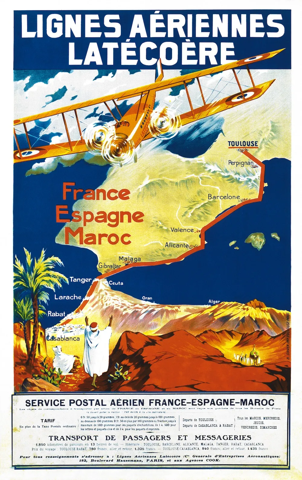
Roberts: Airlines adopted whatever the graphic design fashion was at the time. For example, the very first flight maps after World War I were designed in the Art Nouveau style. There were also a lot of pictures of aircraft and the places that you could fly to and the people you would likely meet while there. So the maps had two purposes. One, to show you that you can get to places faster than ever before no matter how inconvenient, and the other was to reassure people with friendly, everyday images.
Ovenden: In the first couple of chapters of the book, I was amazed to see how few maps didn’t contain a [picture of] a miniature aircraft on them. If you transport yourself back to the 1920s and ’30s, aviation was still a new technology and the idea of flying was a new way of traveling for the masses, who before then only traveled via train, boat or by walking. So the idea of air flight, especially for ordinary people to take part in, was practically unheard of, which was the reason for the airlines to start putting aircraft imagery on their maps.
How have airline maps evolved over time?
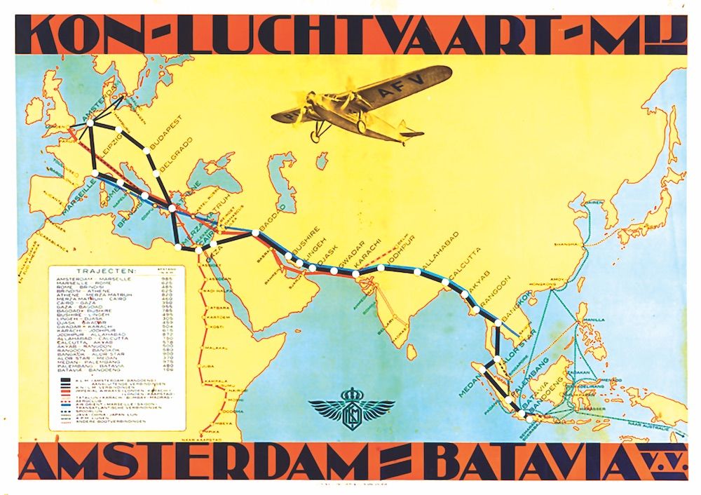
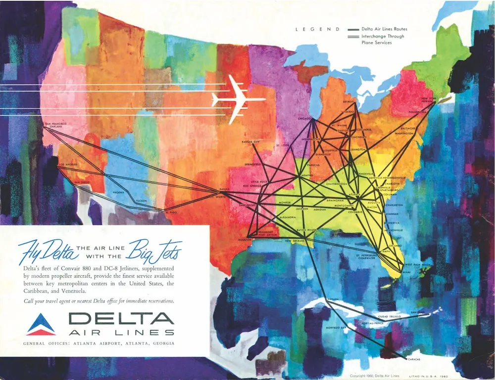
Roberts: This book is not just about the history of maps, it’s also the history of design. Airlines followed whatever design trends were popular at the time, going from Art Nouveau to Art Deco to a more somber style in the 1940s and ’50s. Early on, they used a more sumptuous design to persuade rich people to fly, but after World War II, airlines were trying to encourage ordinary people to fly as it became cheaper for airlines to fly at longer ranges.
Ovenden: Maps started to change in the late 1930s and ’40s when more routes were becoming available and more people were able to fly, therefore making it no longer the domain of the rich. For example, Harry Beck, [who famously designed the London Underground map, also created a route map for Imperial Airways in 1935]. Beck showed the way that you could use diagrams and make them useful for people traveling by air.

Airline Maps: A Century of Art and Design
A nostalgic and celebratory look back at one hundred years of passenger flight, featuring full-color reproductions of route maps and posters from the world's most iconic airlines, from the author of bestselling cult classic Transit Maps of the World.
You scoured museums, archives, websites and more in search of old route maps. What were some of the most surprising things you unearthed?
Roberts: We like the way in which the world gets twisted up. For example, in the 1940s there was sort of an avant-garde thing taking place [in route map design] that shred up the world [from being shaped like a sphere] and making it look like [the petals of] a flower [or other shapes]. Graphic designers were trying new things and distorting [what the world looked like]. A lot of the maps make us laugh and the designs are absolutely hilarious. For example, Svitlet [a Czechoslovakian airline founded in 1948], showed its routes [on the sole] of a flying boot standing down an aircraft.
Ovenden: Another example of [distorting the world] was a map by Scandinavian Airlines [SAS] from the 1950s that shows the Earth being twisted into a spiral. SAS was known for being very innovative with its designs. What definitely came out from our research is seeing that airlines like SAS, KLM, Air France and Air India really put a lot of money and thought into their designs, but then there were also other airlines that perhaps didn’t think things through and weren’t quite as clever.
In the book's introduction, you wrote that “this book, in its own way, tells the story of 20th century design.” Could you elaborate on this idea?
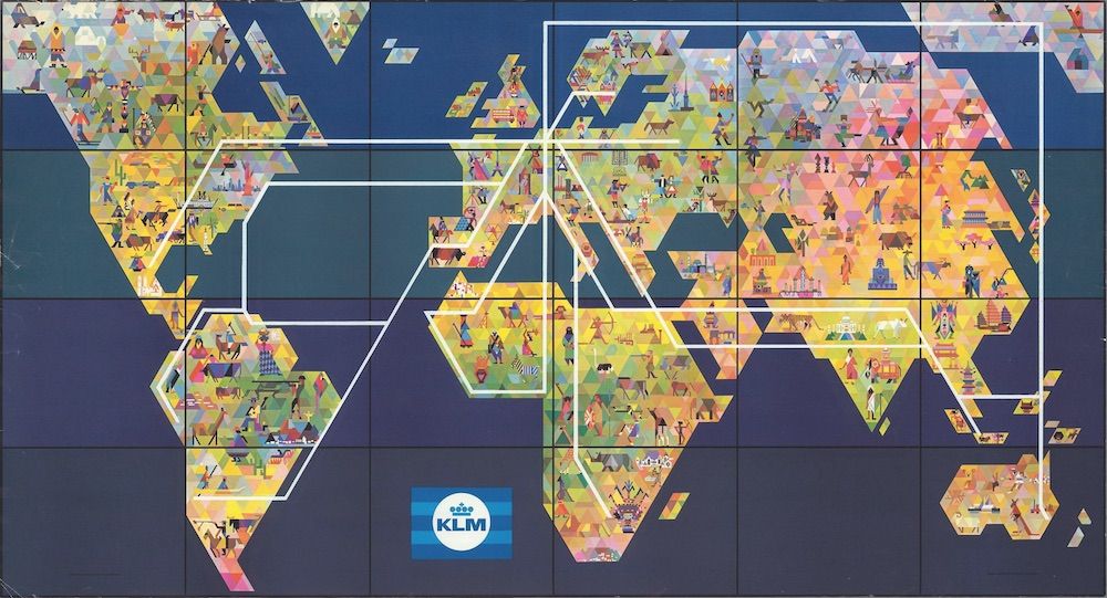
Roberts: At one time, route maps were all hand drawn and painted. The depictions of airplanes and people were absolutely gorgeous, but sadly those began to fade away in the 1960s and ’70s when artistry started to be left behind. As air travel became more mundane, so did the design of the route maps. As we researched, we could see the design fade away. The last chapter was hard to fill.
With the advancements in technology, do you think airline route maps will eventually become a thing of the past?
Roberts: There are two types of maps. The first is the route map that tells you where your aircraft is traveling; technology has replaced those because you can view a flight path in real time on the seatback screens of an airplane showing you exactly where your aircraft is. Airline service maps, which are more of what this book is about, are there for publicity and for defining a territory and for planning a journey. Technology won’t take away the need to advertise. It’s not so much technology taking away from the maps, I think it’s a loss of excitement of air travel, which is taking away people’s desire to show things in these grand fantastic ways.
Ovenden: I agree, and just occasionally in modern times, you have people who are prepared to make maps using new ideas. We’d love to see more designers do that. During the book launch, we almost set down a challenge now to the airlines around the world that they’ve seen the best of what there is, and that we challenge them to design even better airline route maps.
A Note to our Readers
Smithsonian magazine participates in affiliate link advertising programs. If you purchase an item through these links, we receive a commission.