Archives Reveal Touching Stories on the Life of Robert Indiana, the Man Who Invented “LOVE”
Smithsonian curators reflect on the legacy of the iconic artist, following his death at age 89
/https://tf-cmsv2-smithsonianmag-media.s3.amazonaws.com/accounts/headshot/botten_author_pic.JPG)
/https://tf-cmsv2-smithsonianmag-media.s3.amazonaws.com/filer/a9/34/a934d764-1abc-4939-a6c2-2a83ba800725/love5.jpg)
“Robert Indiana was born in the state of the same name in 1928,” began a short biographical description handwritten by the artist for the catalog of his first solo exhibition at the Stable Gallery in 1962: “He studied in Chicago and Edinburgh and returned from a travelling fellowship to live (sic) paint on the New York waterfront. Here in his first one-man show he recapitulates salient events in one American life.”
While the artist would become inextricably linked to his LOVE design and the Pop art movement, Indiana’s broader body of work—infused with numbers, words and symbols—incorporates autobiographical, literary and historical references to make hard-edged elegies to the American dream.
Born Robert Clark in New Castle, Indiana in 1928, the painter, sculptor and poet who would adopt the name Indiana—what he called his “nom de brush”—died on May 19, 2018 at the age of 89. He would become, as author and scholar Barbaralee Diamonstein-Spielvogel, first noted, “the man who invented Love.”
LOVE in all its iterations—translated by the artist into Spanish and Hebrew for sculptures; painted into an unprintable four-letter word after a falling out with Ellsworth Kelly; or repurposed in 2008 as HOPE in a print made as a fundraiser for Barack Obama’s first presidential campaign—is often shorthand for Indiana’s artistic output. Virginia Mecklenburg, chief curator of the Smithsonian American Art Museum notes that while Indiana was associated with Pop artists such as James Rosenquist, Roy Lichtenstein and Andy Warhol, he was different. “They were focusing our perceptions on the products of our consumer society. LOVE was not about consumer culture but the emotions through which we live our lives.”
That Indiana never copyrighted his widely-imitated LOVE design was something of a scourge to the artist, who amassed a large collection of knock-offs. But the more personal revelations in the work are not as easily plagiarized as its graphic lines: In various interviews, Indiana points to LOVE as taking inspiration from spiritual rather than erotic origins, but, like much of his work, his LOVE painting of 1966 is saturated in color and autobiography.
Robert Indiana’s LOVE design is represented in collections across the Smithsonian Institution along with other works of his art. These exemplify and offer insight into the full scope of the artist’s career.
Oral histories at the Smithsonian’s Archives of American Art’s include many interviews with artists who discuss their friendship with Indiana and his work, but among the most insightful is the 1963 interview with the artist himself conducted by Richard Brown Baker, a collector of contemporary art.
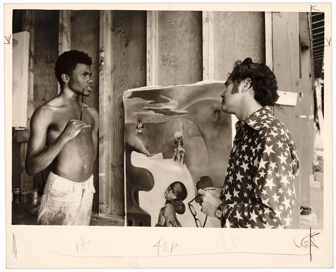
In it, Indiana speaks at length about his unsettled childhood and early education—aggravated by his mother’s tendency towards wanderlust that saw the family moving to 21 houses by the time he was 17— his interest in poetry and literature and his time living at Coenties Slip in lower Manhattan among a community of artists that included Ellsworth Kelly, Agnes Martin, Lenore Tawney and Jack Youngerman.
A Christmas Card found in the papers Dorothy Miller, who was a curator at the Museum of Modern Art, provides a preview of LOVE in its early concept stage. As the Archives’ curator of manuscripts Mary Savig describes in her book Handmade Holiday Cards from 20th-Century Artists:
One of the first iterations of Robert Indiana’s most publicly adored subject, the LOVE motif, was a card sold by MoMA in 1965. For his holiday card of 1964, Indiana had made pencil rubbings of the word LOVE, complete with his signature slanted O; one recipient of his card was MoMA curator Dorothy Miller. The following year MoMA commissioned from Indiana a more-colorful take on the original design for its holiday-card line.
In 1964, the same year Robert Indiana sent out his LOVE holiday card, he collaborated on a film, Eat, with Andy Warhol, in which, through the wizardry of film editing, Indiana eats a continually replenishing mushroom for 35 minutes. For the New York World’s Fair, he was one of ten artists commissioned by Phillip Johnson to create an artwork for the New York State Pavillion’s curved facade. Indiana’s creation, a 20-foot tall sign of five black circles arranged like the face of a five-sided die with letters that lit up to spell out EAT, was sandwiched between works by Ellsworth Kelly and Robert Rauchenberg. The words EAT, DIE, HUG and ERR would be conceits that Indiana returned to time and again—Mecklenburg calls them “iconic commands”—with EAT, the last word his mother said to him before she died, being one of the most profoundly autobiographical.
In a humorous take on the word, Philadelphia art curators Joan Kron and Audrey Sabol modified Indiana’s World’s Fair design into a brooch manufactured by Tiffany for their Genuine Electric Company—one of several business enterprises the women co-owned. After a write up on their projects in the New York Times, they received many inquiries about the pin, some of which are found in Kron’s papers in the Archives. Among them is a note from Mrs. Daniel D. Krakauer of Great Neck, Long Island, asking where she can get one of the EAT brooches to wear at her husband’s surprise 50th birthday party: “I can’t think of a better way of announcing that ‘Supper is Being Served’ than by ‘lighting up. . .’” The letter takes on a sly irony; officials at the World’s Fair had to order Indiana’s sign to be turned off after only one day, because crowds were flocking to the pavilion mistaking it for a food venue. As Indiana wrote, “Too many people had reacted, that first day, to the imperative.”
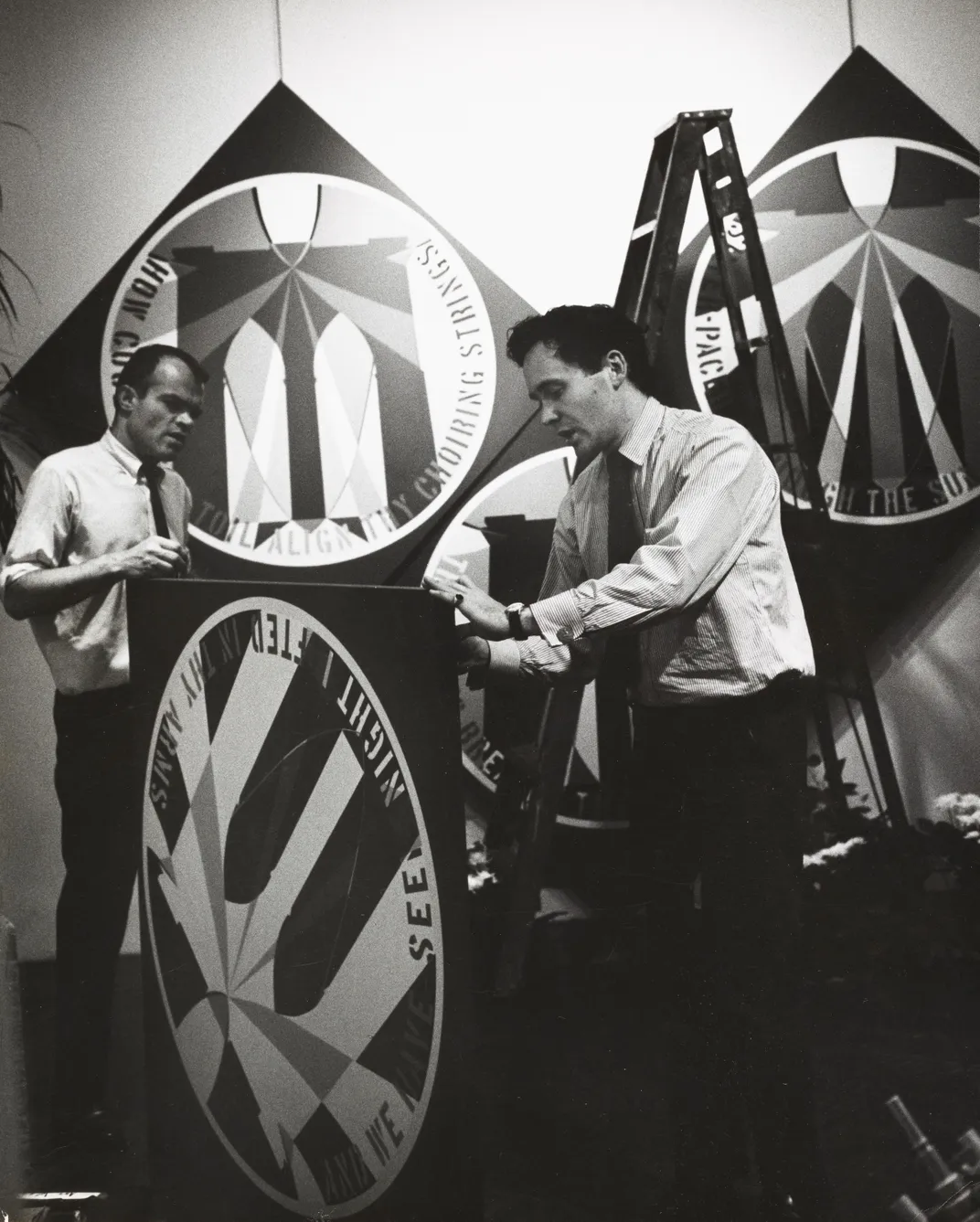
In 1974, after the Smithsonian received the art collection of financier and philanthropist Joseph Hirshhorn, and opened the Hirshhorn Museum and Sculpture Garden as a national museum of contemporary art, the Smithsonian Associates commissioned four posters for opening day, including one by Robert Indiana with an eye-popping blue star and a bold graphic design.
At the time of the museum’s opening there were only two early Indiana paintings—The Eateria, 1962 and Beware-Danger American Dream #4, 1963—in the Hirshhorn collection. Both, says Evelyn Hankins, the Hirshhorn’s senior curator, “are iconic examples of Robert Indiana’s way of using American vernacular, such as road signs, to create striking artworks at the core of Pop art.”

Indiana’s opening-day poster, says Hankins “with its graphic bold star and limited color palette,” not only fit well into the collection and the artist’s oeuvre, but was “very representational as to why Robert Indiana is pivotal to the Pop art world—his use of hard-edge graphics, which are sometimes celebratory and sometimes ask tough questions about the darker side of the American dream.” In this case, especially, celebratory.
Art critic Lucy Lippard declared Indiana an “out-and-out romantic,” noting that the artist’s “contribution has been the marriage of poetry and geometric clarity via the inclusion of American literature and history in a non-objective art.”
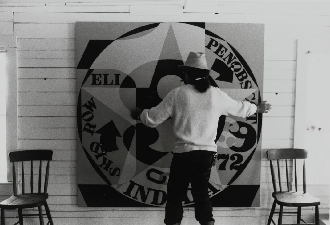
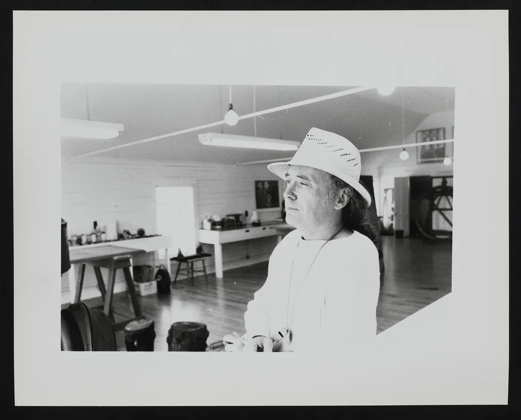
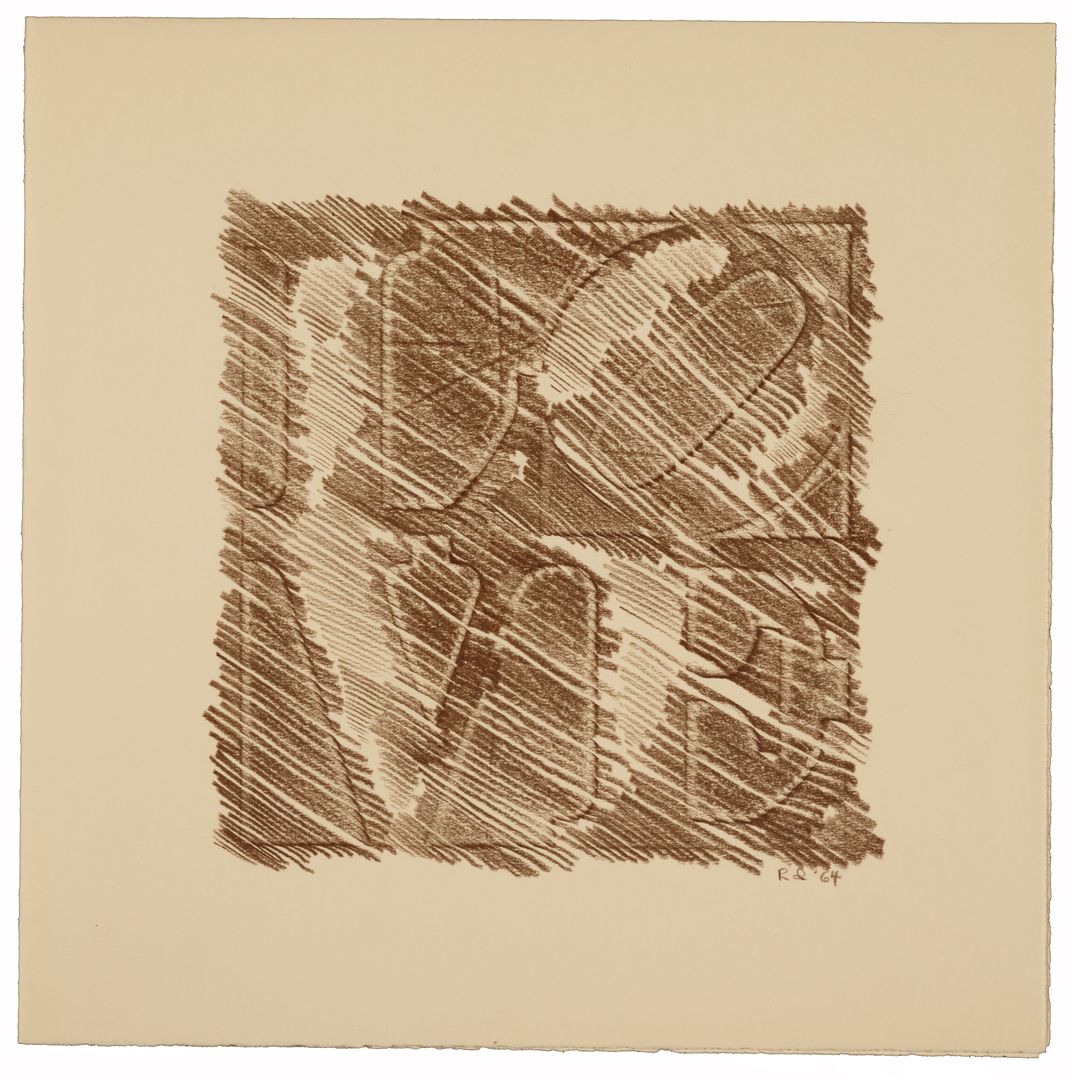
His romantic tendencies are evident in his columnar sculptures made from found wood and objects, including those housed in the collections of the Smithsonian American Art Museum. According to the museum’s Virginia Mecklenburg, who curated the artist’s solo 1984 exhibition “Wood Works: Constructions by Robert Indiana,” these pieces are indicative of his intelligence and working process. “He wanted to make concepts totemic. He saw his sculptures as totems, like the stele that served as way finders along Roman roads in ancient times. Indiana’s sculptures represent presence, power, individuality, as well as words, signs, symbols, ways to mark emotion, places. There was intentionality—these things were on his mind.”
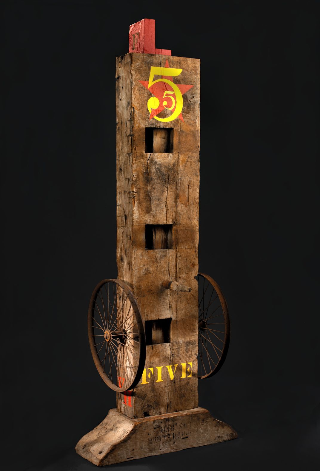
At the time of the 1984 exhibition, Indiana gifted his painting The Figure Five and the museum purchased his sculpture Five. Both are riffs on Charles Demuth’s painting I Saw the Figure 5 in Gold—made as a response to William Carlos Williams’ poem “The Great Figure,” written after an encounter with a fire truck whizzing by on a rainy Manhattan night—and are cornerstones of the museum’s Indiana holdings.
Among the rainand lightsI saw the figure 5in goldon a redfiretruckmoving . . . .
“Bob liked the idea of the sculpture and painting being together,” Mecklenburg recounts. “Demuth was influenced by Williams’ experiential poem—speed, light, the sound of the clanging fire truck—Bob found another way to express this that was of the moment.”

Asked about what it was like working with Indiana on the exhibition, Mecklenburg says Indiana was shy but still allowed her access to his personal journals, pages of which are reproduced in the show’s catalog. “He was quite amazing . . . he was a friend,” she says. “He had a profound sense of American history, naming himself for the state where he grew up—he wasn’t Robert Massachusetts! It was an assertion of Middle America, and that says something about what he valued.”
As he told Diamonstein, “when I was a kid, my mother used to drive my father to work in Indianapolis, and I would see, practically every day of my young life, a huge Phillips 66 sign. So it is the red and green of that sign against the blue Hoosier sky. The blue in the Love is cerulean. Therefore my Love is an homage to my father.”
At the end of Robert Indiana’s oral history interview, Richard Brown Baker suggested that the artist had not been “entirely revealing,” but Mecklenburg argues that Indiana grants a great deal of access to the viewer willing to do a deep reading of his work. Indiana, she says, “was a man who made his mark on the world through his art.”
In fact, Indiana, who saw himself as a painter of signs, once asserted, “I paint the American scene.”
As he laid out plainly in the artists’ statement for the Stable Gallery: “My art is a disciplined high dive—high soar, simultaneous & polychromous, an exaltation of the verbal-visual . . . my dialogue.”
/https://tf-cmsv2-smithsonianmag-media.s3.amazonaws.com/accounts/headshot/botten_author_pic.JPG)