Infographics Through the Ages Highlight the Visual Beauty of Science
An exhibit at the British Library focuses on the aesthetic appeal of 400 years of scientific data
/https://tf-cmsv2-smithsonianmag-media.s3.amazonaws.com/accounts/headshot/Screen_Shot_2014-01-27_at_12.05.16_PM.png)


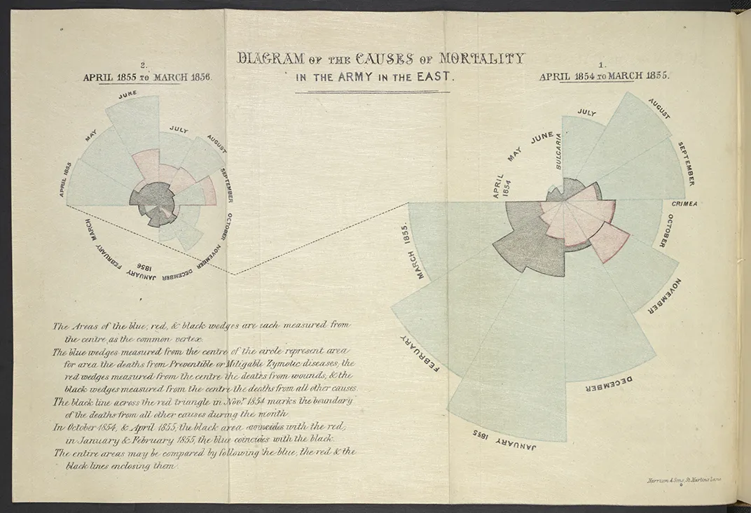
Tacked on to the appendix of a British government health report in 1858, a rose-shaped diagram presented a striking finding: during the Crimean War, far more soldiers died of disease in hospitals than of wounds on the battlefield.
The diagram’s author, famed mother of nursing Florence Nightingale, had a talent for statistics. Today, her rose diagram remains iconic, but Nightingale certainly wasn’t the first to visualize her data, nor would she be the last. An exhibit at the British Library entitled “Beautiful Science” displays 400 years worth of infographics, each with its own fascinating backstory.
The exhibit contains three sections: public health, weather and climate, and the tree of life. Each section features infographics and data visualizations from past and present—allowing visitors to draw conclusions about how scientific visuals have changed, or stayed the same, over the centuries.
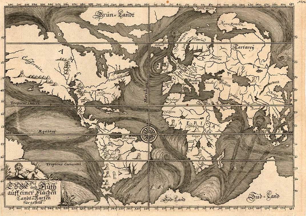
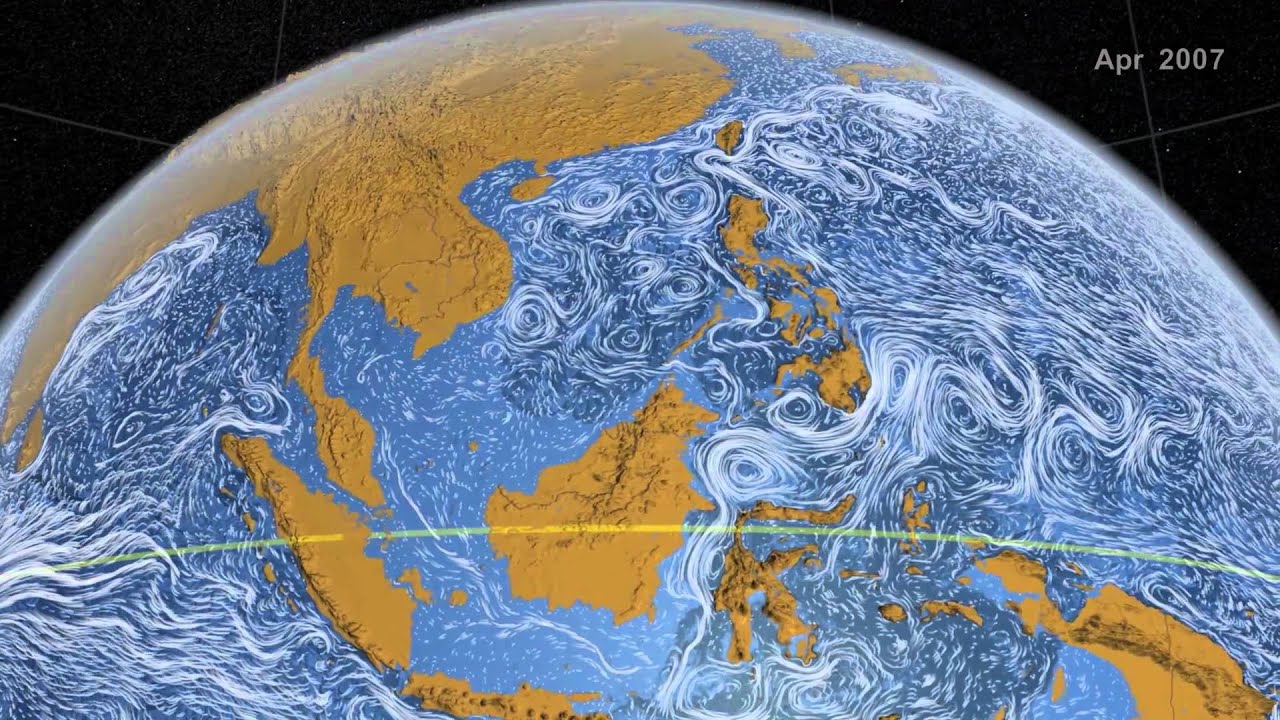
Obviously, a lot has changed over 400 years. For one thing, technology has made modern visualizations much more dynamic. Though perhaps beautiful individually, maps of ocean currents from the 1700s look a little underwhelming compared to the technological wizardry of computer simulations in NASA’s “Perpetual Ocean,” a swirling depiction of the world’s ocean currents that the library has projected onto a large screen in the exhibit.
“The really interesting and exciting difference between then and now is the degree to which we can actually use the data. And in fact, data is no longer static, but it’s actually something through which we can explore our world and interact,” says Johanna Kieniewicz, who curates the exhibit for the British Library.
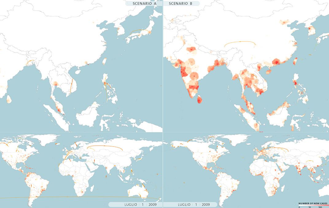
For example, in the public health section an interactive program called Epidemic Planet (developed by researchers at Northeastern University and the ISI Foundation in Italy) allows visitors to tinker with parameters and see how an epidemic would spread across the globe under different settings.
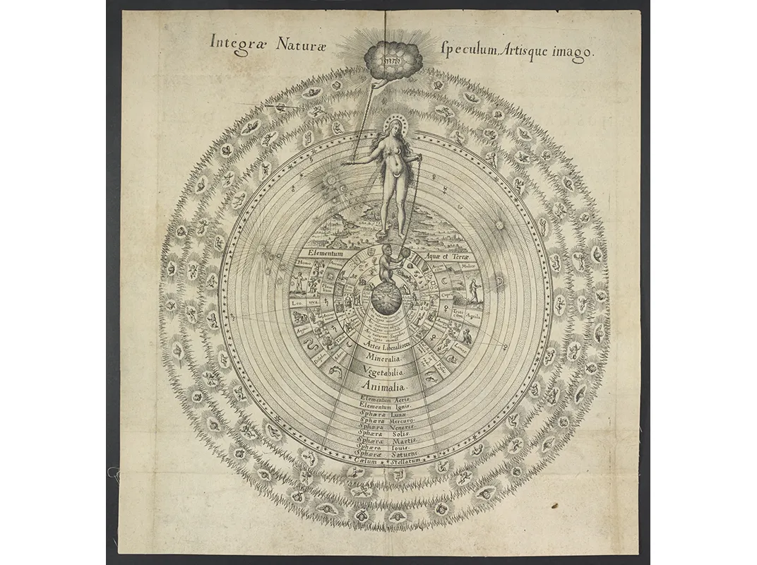
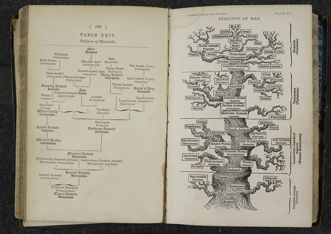
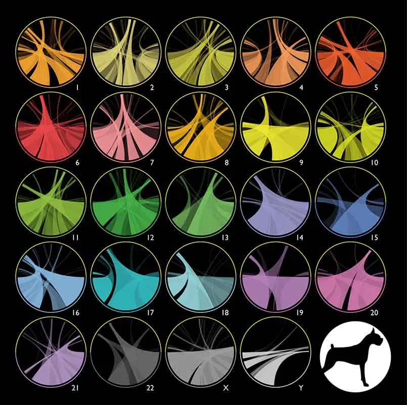
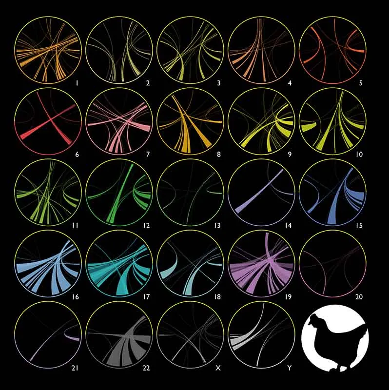
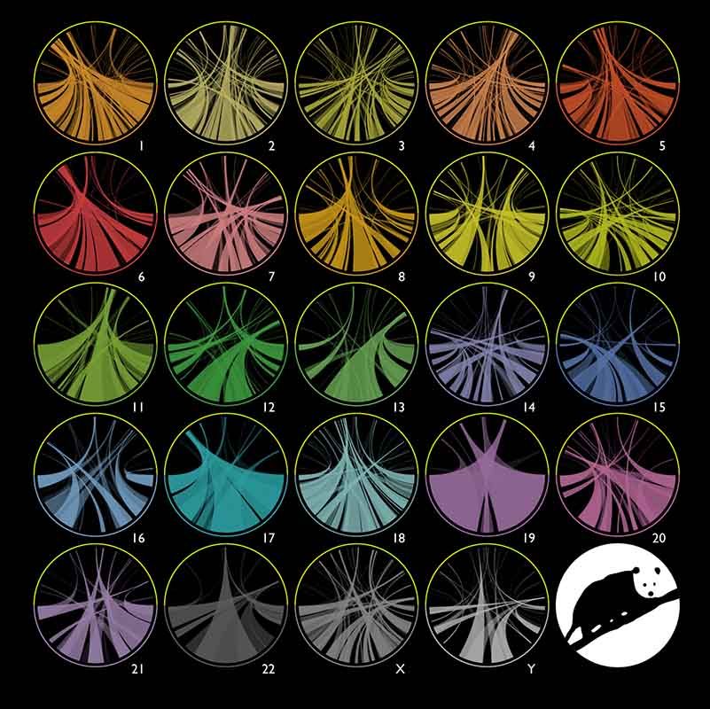
The tree of life section includes the oldest document in the collection: an image of the ancient Greek concept of the Great Chain of Being, depicted in 1617 by English physician Robert Fludd. The newest items in the exhibit are works such as One Zoom Tree, an interactive program developed by scientists at the Imperial College London that allows users to zoom in and explore different branches of the evolutionary tree. Another visual called “Circles of Life” by Canadian artist Martin Krzywinski depicts the genetic similarities between humans and other animals, including chimps and chickens, through colorful circle graphics generated by a computer program called Circos.
The visuals might at first seem totally unrelated, but subtle parallels—between the Great Chain of Being, Darwinian evolution, and modern taxonomic trees based on genetic data—show humanity’s continual efforts to classify and understand life and its ties to nature.
/https://tf-cmsv2-smithsonianmag-media.s3.amazonaws.com/filer/bf/14/bf14ff82-cf57-4b36-9b7b-45a1b4ac817e/circles_of_life_platypusedit.jpg)
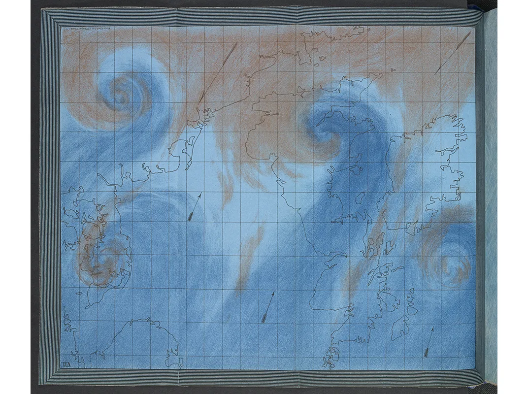
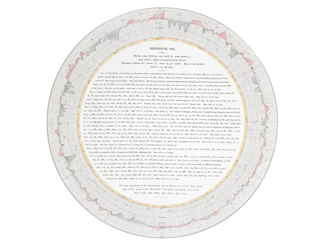
In the weather and climate section, the work of amateur 19th-century meteorologist Luke Howard, who obsessively measured barometric pressure outside of his London home every day, doesn’t seem that far off from today’s citizen scientist movement. Like Nightingale’s diagram, Howard’s work also questions the idea that “big data”—the exponential and unstructured growth of observations—is a modern phenomenon. Sure, we have better tools for crunching the numbers today, but datamongers of the Victorian era were equally dedicated to recording all that they could observe.
Infographics have long played a role in scientific endeavors. “These diagrams are both tools of discovery as well as scientific communication, so in a sense [they are] highlighting the importance of data visualization to the overall scientific process,” says Kieniewicz.
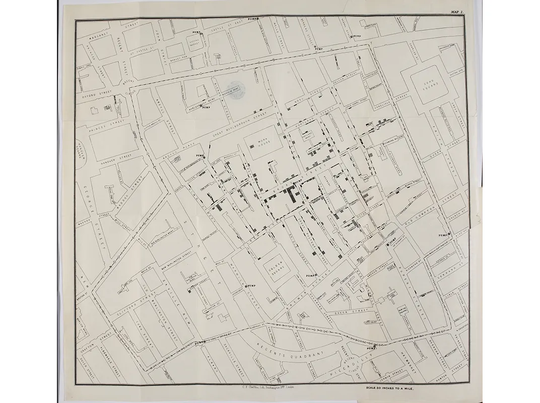
She points to an 1855 map of London’s SoHo district by another English physician, John Snow, which shows cholera deaths clustered around a local well. Snow thought that water contamination—not miasma or “bad air,” prevailing ideas at the time—lay at the root of sweeping cholera epidemics hitting the city. The map became an iconic and invaluable tool for Snow to both prove his hypothesis and communicate science to those who doubted him.
In some sense, the exhibit—like the data it shows—is itself a tool for discovery. Kieniewicz hopes that visitors will be inspired to “see how interesting some of these stories actually are and be keen to learn more.”
Moreover, the exhibit shows that science can be a visual pursuit. “There is a beauty that is inherent in the science and that’s something that we should actually celebrate,” says Kieniewicz.
“Beautiful Science” will be on view at the British Library through May 26, 2014.
/https://tf-cmsv2-smithsonianmag-media.s3.amazonaws.com/accounts/headshot/Screen_Shot_2014-01-27_at_12.05.16_PM.png)