W.E.B. Du Bois’ Visionary Infographics Come Together for the First Time in Full Color
His pioneering team of black sociologists created data visualizations that explained institutionalized racism to the world
![11 33873a City and Rural Population 1890[1].png](https://th-thumbnailer.cdn-si-edu.com/h2WL28E-CZgGj-Lrvs40-3PMAOE=/1000x750/filters:no_upscale():focal(1223x1116:1224x1117)/https://tf-cmsv2-smithsonianmag-media.s3.amazonaws.com/filer/3b/22/3b22a3d0-0a6f-42fb-a1d6-58019a3d9312/11_33873a_city_and_rural_population_18901.png)
After three decades of emancipation, the gains made by African-Americans, those that existed at all, presented a decidedly mixed picture about the state of racial progress in the country. The political obstacles were voluminous, with the failure of Reconstruction still lingering, and Jim Crow institutional racism ascendant. In 1897, the United States Supreme Court would rule in Plessy v. Ferguson that separate was indeed equal. All the while, new generations of African-Americans found ways to uplift themselves, despite discrimination, through grassroots efforts in education, work and community building.
After graduating with a Ph.D. in history from Harvard University, W.E.B. Du Bois, the prominent African-American intellectual, sought a way to process all this information showing why the African disapora in America was being held back in a tangible, contextualized form. ”It is not one problem,” as Du Bois wrote in 1898, “but rather a plexus of social problems, some new, some old, some simple, some complex; and these problems have their one bond of unity in the act that they group themselves above those Africans whom two centuries of slave-trading brought into the land.”
To accomplish this goal, Du Bois turned to the burgeoning field of sociology. Sociology’s scope in history, statistics, and demographics held the potential to quantifiably reveal "life within the Veil," as Du Bois called the structural forces of oppressions that separated black and white populations, whether that came to educational attainment, voting rights or land ownership.
And so, almost two decades before Robert E. Park and the Chicago school were conducting ethnographic field work and statistical analysis, Du Bois pioneered a new way to use sociology: to use those methodologies to contextualize the historical realities resonating among African-Americans.
After embarking on a sprawling sociological study of African-Americans living in Philadelphia, he was hired as a professor at the historically black Atlanta University in 1897. There, he established a sociology program, now recognized as the first school of American sociology. It was in this capacity that a former classmate of Du Bois, Thomas Junius Calloway, approached Du Bois to ask if his old friend would contribute a social study about African-American life to the Exposition Universelle, the Paris World Fair of 1900.
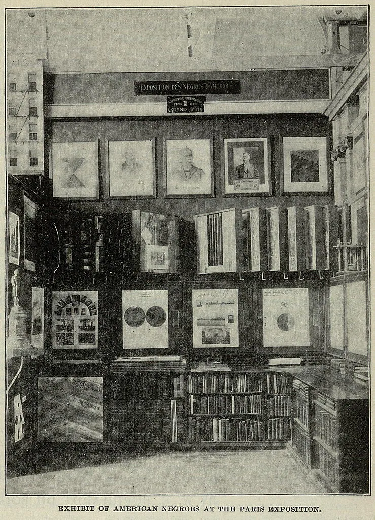
Calloway, an educator, journalist and lawyer, had petitioned the U.S. government for space to display the progress made by African-Americans since slavery in the American display. The federal government’s department of education and social economy agreed to sponsor the exhibit, and in January 1899, it appointed Calloway a special agent to complete the task. With a short window of time before the fair, Calloway approached the leading African-American thinkers of the day to include their work in the upcoming exhibit, which was called “The American Negro.”
For Du Bois, the show presented both an opportunity and a challenge. Part of his contribution was carefully curating 500 photographs to show a nuanced snapshot of what life was like for black Americans. While he wanted to use the photographs to undercut racist stereotypes about African-Americans, the images alone did not relay the underlining ways that the institution of slavery continued to impact African-American progress in the country. So he set about making approximately 60 carefully handmade data visualizations, to dictate, in full, vibrant color, the reasons why black America was being held back.
The project presented Du Bois with a way to further test the possibilities of visualizing the empirical data he and his Atlanta University students and alumni were collecting, says Britt Rusert, associate professor in the W. E. B. Du Bois Department of Afro-American Studies at the University of Massachusetts, Amherst.
Rusert and Whitney Battle-Baptiste, associate professor of anthropology at U-Mass and director of its W.E.B. Du Bois Center, are the editors of a newly published book, W.E.B. Du Bois’s Data Portraits: Visualizing Black America. It is, somehow, the first time that Du Bois’ groundbreaking data visualizations from the Paris World Fair have been collected together in color in a book format.

W. E. B. Du Bois's Data Portraits: Visualizing Black America
The colorful charts, graphs, and maps presented at the 1900 Paris Exposition by famed sociologist and black rights activist W. E. B. Du Bois offered a view into the lives of black Americans, conveying a literal and figurative representation of "the color line." From advances in education to the lingering effects of slavery, these prophetic infographics—beautiful in design and powerful in content— make visible a wide spectrum of black experience.
While they are known as Du Bois’ infographics, he wasn’t working alone; it took an interdisciplinary team of black students and alumni spread across the South to create them. Likewise, Rusert, Battle-Baptiste and book designer Silas Munro combined their areas of expertise to tease out just what made these works such a landmark achievement of their day.
“[Du Bois and his team] had a set of questions, and they knew they needed to use different tools and different methods in order to represent the data and to grapple with those questions,” Rusert says.
While Aldon Morris, professor of sociology at Northwestern University—who resurrected Du Bois’ rightful place at the birth of sociology in his 2015 text, The Scholar Denied (and also contributed a chapter for W.E.B. Du Bois’s Data Portraits)—detailed how the black students of Du Bois’ program were practicing and engaging in sociological work decades before their counterparts in the Chicago school, much remains to be learned about the work being done in Du Bois’ sociology laboratory.
“The more that you look at the [visualizations], you start to see more and more hands,” Rusert says. Correspondences suggest, for instance, that William Andrew Rogers, an alumnus of Atlanta University who had a degree in sociology, played a major role in creating the infographics. “At least once Du Bois identifies him as being the point person, or the sort of lead person in this project,” says Rusert.
But Du Bois wasn’t just using his own students in the sociology lab at Atlanta University; he was also drawing data and relying on surveys, which were “conducted by a sort of extended network of field researchers across the South,” according to Rusert. That included students who graduated from Atlanta University and moved elsewhere, showing evidence of a network of black sociologists throughout the region.
One set of infographics explored life for African-Americans in Georgia—which at the time had the largest black population in the U.S.—breaking down the number of black children enrolled in public schools, family budgets, income and expenditure, occupations, and even the value of household and kitchen furniture owned. The second set of infographics had a more expansive purview, comparing national and international data sets, such as examining the literary rate of black Americans in comparison to other nations, as well as looking at what the occupations of black Americans were, where they lived in the U.S., and how much land they held.

The way DuBois wielded this data to convey these realities was pioneering, but so, too, were the visual aesthetics of the infographics. Munro, who wrote the captions for each of the plates, came to see Du Bois as an innovator in design. In the book, he positions the data visualizations as “infographic activism” in their ability to get to the heart of inequities of the day. But he also points out that the compelling art, which was done in ink, gouache watercolor, graphite and photographic prints, deserves to be considered in its own right. The team’s Modernist use of shape, color and structure, created just before the rise of Europe’s avant-garde movements, he argues, makes the work nothing less than visionary.

For Rusert’s part, as she worked through the archival history, she saw Du Bois as a curator, observing his intentionality of detail, which included carefully positioning the large-scale color data visualizations on the walls of the exhibit hall. “He clearly had these ideas about how and where he wanted these images to be installed, and how he wanted them to be presented,” she says. Du Bois was so determined to travel to Paris and install the works himself, she says, that he scrounged up the money to pay for passage in steerage. It was a degrading means of travel that he could not have taken without some irony, knowing he was on his way to extrapolate why African-Americans continued to be treated as second-class citizens in the U.S.
The data graphics were designed to appeal to both an international and stateside audience. They included French typography and writing to reach Europeans, says Rusert. However, she adds, the team also had an eye to U.S. audiences when they worked, as they knew the exhibit would eventually travel back home, going on view at Buffalo's Pan-Am Exposition, along with other stops around the country.

When the tour of the exhibit was finally finished, all of the materials—photographs, essays, research, the data visualizations, and more—were packed up and sent to the Library of Congress. There, they’ve stayed for decades. It wasn’t until the Library digitized the holdings that the vibrant, bold historical visualizations of Du Bois and his Atlanta team became widely available for view. With their dissemination came renewed interest in their work.
“It really speaks to our own moment in which people are thinking about race and data and thinking about visual design and thinking about data visualization,” says Rusert. Today’s technological advancements opens up a bold new frontier for the possibilities of using data visualization to demonstrate inequities embedded in today’s society. Take, for instance, MacArthur genius grant award-winner Nikole Hannah-Jones’ work utilizing data to reveal the rampant school segregation in play today. Or the Los Angeles Times’ thought-provoking “Mapping L.A.” project. In an especially out-of-the-box example, Jillian Crandall, an architect and researcher, uses data visualization in a video game format.
Certainly, the means of collecting and displaying information today far surpass what Du Bois and his Atlanta University team were working with in 1900. Yet their findings remain compelling today. Just last year, the Guardian’s data editor was inspired to recreate the visualizations to reflect the realities of inequality in today’s world.
W.E.B. Du Bois’s Data Portraits was published on the sesquicentennial year of the Du Bois’ birth, and it further reaffirms the scholar’s place as a founding figure in American sociology. The recirculation of Du Bois’ data portraits offer a new opportunity to marvel at the forward-thinking work being done at Atlanta University.
It seems safe to say Du Bois would have been happy to see his work retain such relevance. Even in 1900, it appears he had other plans for his data visualizations than being quietly stored away in the Library of Congress. When Rusert and Battle-Baptiste were working on the book, they found Du Bois had written a letter to Callaway requesting whether it was possible for him to get the images back. Callaway, in turn, told Du Bois to write directly to the Library of Congress. As the infographics never left the Library, it appears he was not successful.
What was he hoping to do with them? Rusert believes there’s definitely a possibility he was interested in using them to teach his disciples at Atlanta University. “If so,” she says, “we can think about them as sort of like visual aids for classroom learning.”
A Note to our Readers
Smithsonian magazine participates in affiliate link advertising programs. If you purchase an item through these links, we receive a commission.