Would You Like Arches With That? When Famous Architects Design McDonalds
Franchises of the fast food behemoth become roadside art
![]() Ever since the late 1960s, when McDonald’s abandoned its iconic, modernist-inspired golden-arched buildings in favor of a separate, golden-arched sign and a decidedly less exciting mansard-roofed structure, it has been rare to mention the words “McDonald’s” and “architecture” in the same sentence. Rare, but not unheard of, as a few notable architects designed some of the franchise’s more exceptional establishments.
Ever since the late 1960s, when McDonald’s abandoned its iconic, modernist-inspired golden-arched buildings in favor of a separate, golden-arched sign and a decidedly less exciting mansard-roofed structure, it has been rare to mention the words “McDonald’s” and “architecture” in the same sentence. Rare, but not unheard of, as a few notable architects designed some of the franchise’s more exceptional establishments.
But the biggest franchise in the world can afford to take a few risks and have a little fun. In 1983 McDonald’s approached a man named David Bermant to build a new restaurant in the parking lot of one of his Berwyn, Illinois, properties. Now Bermant loved two things: building shopping centers and collecting art. McDonald’s gave him the opportunity to do both. He agreed to let them build with one stipulation – they build something daring.
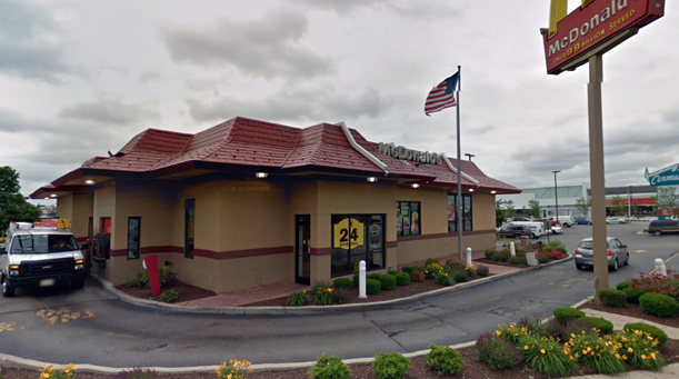
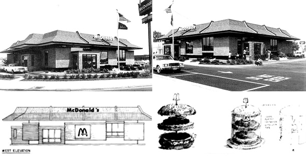
New York architecture firm SITE was brought in. At the time, SITE was known for bringing a surprising sculptural sensibility to the Best Products retail stores and they brought that same subversive approach to their work for McDonald’s, identifying the standard ingredients, as it were, of a typical franchise –mansard roof, brick exterior, Colonial-style windows, golden arches– and then re-presenting them in a new way. Their design is a subtle subversion on the classic 1980s franchise. All those elements are there, but they’re separated just enough to create the illusion of a “floating” McDonalds. The entire brick level of the mansard roof seems to be separating from the brick structure, which is itself levitating a few feet off the ground, making room for a miniature garden.
Many architects aren’t content with just designing the building – they often want to design furniture, lighting, sometimes even doorknobs and silverware. SITE’s no different, but instead of proposing redesigned plastic benches, they designed a “floating Big Mac” to complement the building. Unsurprisingly, McDonald’s passed on that addition, opting to only construct the SITE design in 1983. Perhaps also unsurprising? The floating McDonald’s no longer floats; when the franchise dulled the design is unclear.

SITE’s “floating” McDonald’s as it stands today. (image: google maps)
Another significant McDonald’s was built in the 1990s by renowned architects Robert Venturi and Denise Scott Brown in Buena Vista, Florida.

The original Beuna Vista, Florida McDonald’s designed by Venturi Scott Brown associates (image: Matt Wargo)
Venturi and Scott Brown describe their design as “a classic example of American commercial architecture defined by signage and symbolism within a roadside context whose conventional order we tweaked, in cooperation with McDonald’s.” Those not familiar with the architects may be wondering why this building is worth a mention. They had been advocates of “ugly and ordinary” architecture since 1968 when they famously took a studio of Yale architecture students to Las Vegas to study urban sprawl and the auto-centric American city in the seminal “Learning from Las Vegas” studio. It was a radical proposal at the time and the work was seen as a challenging provocation to the architectural establishment. They made it acceptable for scholars and historians to talk about things like McDonald’s.
The architects built a career on their fascination with signs and the role of communication in architecture. Like the architect of the very first McDonald’s, Venturi and Scott Brown weren’t designing a building with a sign, but a building that was a sign. This McDonald’s, unmissable from a passing car, is what Venturi and Scott Brown would call an “architecture of communication,” and it doesn’t just date back to the earliest hamburger stands, but to the earliest traditions of the profession. In fact, for them, from a conceptual perspective, there’s surprisingly little difference between a casino and a cathedral.
The Buena Vista McDonald’s is in part a manifestation of the lessons they learned in Vegas, lessons that would inform their practice for decades (though most of their work is much more reserved than this jubilant expression of commercialism). But the building is perhaps also noteworthy for its shockingly refreshing honesty. There’s no pretense here. It wears its happy meal toy on its sleeve. What you see is quite literally what you get. It was a near-perfect embodiment of the McDonald’s identity at the the time it was built. But of course, a building-as-brand only works when until the brand changes. When the company decided to focus less on the happy meal crowd and target a more mature demographic, they once again turned to Venturi and Scott Brown to redesign their flagship Disney-adjacent location in Florida.
The renovation was dramatic, transforming the cartoon-like “pop” structure into a more reserved, contemporary building. Its giant golden arches and anthropomorphic foodstuffs were replaced with a minimal white arch separated from the building’s facade, an abstracted, modernist ‘M’ leading to the entry, a modern triumphal arch. But the architects weren’t done with the arches yet and kept an set in the basement of the office, which were dusted off in 2009 for a retrospective of their work at the Yale School of Architecture, where the giant, illuminated golden arches of dominated the concrete exhibition space, communicating a new idea, one that SITE and Venturi Scott Brown knew well, but more architects could do to learn: lighten up.
/https://tf-cmsv2-smithsonianmag-media.s3.amazonaws.com/accounts/headshot/Jimmy-Stamp-240.jpg)

/https://tf-cmsv2-smithsonianmag-media.s3.amazonaws.com/accounts/headshot/Jimmy-Stamp-240.jpg)