How Andy Warhol Came to Paint Campbell’s Soup Cans
He was talented and prosperous, but the young visionary worried the art world had left him behind. Then he discovered soup
:focal(388x354:389x355)/https://tf-cmsv2-smithsonianmag-media.s3.amazonaws.com/filer/d3/53/d3535fd5-a6ce-4408-adbb-4e4d5ab271ea/warhol-1.jpg)
At the tail end of April 1961, a teenage girl walking by the window of the old Gunther Jaeckel shop on 57th Street might have done a double take. The matronly furrier, recently bought out by the neighboring Bonwit Teller department store, had decided to show stylish dresses in bright florals, reds and blues—eye candy sure to appeal to a girl’s fashion sweet tooth. The window’s display man was working the same vein: Behind the red dress he had hung a hugely enlarged panel from a Lois Lane comic our girl would just have read; Superman’s scarlet tights in that panel, recently painted just for that window, were a perfect match for the color of the frock in front of it. The display man had the blue dress placed in front of an image from a Popeye cartoon that featured a matching hue. Blown-up details from girl-friendly magazine ads hovered in black-and-white behind the multicolored florals. That window’s props had been made by a certain Andy Warhol, and they were the very first of his paintings that went on to count as Pop Art.

Warhol
The definitive biography of a fascinating and paradoxical figure, one of the most influential artists of his—or any—age
Since moving from Pittsburgh 12 years before, Warhol had built a career for himself as one of New York’s more stylish window dressers and top shoe illustrators, with ads that ran in the society pages of the New York Times. Those vitrines and ads had paid for a nice Victorian town house in the gentrifying Manhattan neighborhood of Carnegie Hill, complete with a basement suite for his aging mother and the beginnings of an art collection, and had given him some standing among the city’s gay culturati. But at the dawn of his second decade in New York, Warhol’s campy, hand-drawn advertisements were losing market share to sleek photographs, while his long-standing ambitions in fine art could no longer be repressed. His window display for Gunther Jaeckel turned out to be the hinge between his success in commercial illustration and the greater fame and fortune he eventually found in fine art. But when he came up with the paintings he’d used as that window’s props, he himself may not have been fully sure of their meaning. Staged as backgrounds to color-matched goods, Warhol’s paintings only achieved greatness once Warhol decided they ought to live as art, and convinced dealers and curators to show them.
An entire, developed aesthetic of Pop already existed out in the non-art world where Warhol had worked in the ’50s: It was standard to use details from everyday life—ice-cream cones or a Coke bottle—to jazz up a window or an ad, as Warhol himself had been known to do. Warhol’s comic-strip panels would not have shocked any window-shopper. What changed as the ’60s dawned was that Warhol, just then swerving from ads to art, came to use that entire commercial aesthetic as a ready-made, the way Marcel Duchamp had presented manufactured urinals and bottle racks as museum-worthy art. Warhol’s Pop wasn’t about borrowing a detail or two from commercial work; it was about pulling all the most dubious qualities of the commercial into the realm of fine art and reveling in the confusion that caused. When, over the following year, he declared that window props were gallery paintings, he was ceding almost all control of his aesthetics to a radical force outside himself that, in the art world at least, was close to taboo: capitalist consumerism.
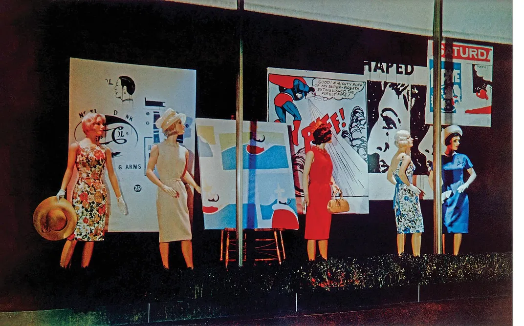
Warhol could not quite go there at first: Even to him, the Gunther Jaeckel window paintings clearly seemed too purely commercial to make an easy transition into high culture. That’s why, in the second half of 1961, he got busy turning his display props into objects that were more unmistakably arty. He added distinctly artistic flourishes to his Superman painting, for instance, throwing in a bunch of brush strokes that weren’t there when it was in the store window; he also whited out some of the text in its speech bubble for an effect that he must have felt was more “poetic.” (That was the kind of romantic conception he rejected wholesale once he settled more deeply into Pop.) Warhol made new riffs on his other Gunther Jaeckel canvases, crafting a picture that zoomed in more closely on Popeye and others that added Batman and Dick Tracy to his cast of colorful superheroes. He was working toward the aesthetic that would go on to win him national recognition, but he was still some ways from earning that. Throughout 1961, Warhol witnessed shows and reviews piling up for friends and acquaintances—Philip Pearlstein, Larry Rivers, Alex Katz, Yves Klein, his old teacher Balcomb Greene, even Warhol’s schoolmate Gillian Jagger—while he remained an also-ran at best.
At the end of the year, Claes Oldenburg, another Pop pioneer, mounted The Store, a landmark installation where he sold papier-mâché copies of everyday merchandise. Warhol saw it and was so sick with jealousy that he skipped a friend’s dinner party. Roy Lichtenstein and James Rosenquist were starting to enjoy similar success with their paintings derived from comic books and billboards. Warhol, said a friend, “was just so depressed that it was all happening and he was not getting any recognition”—a situation suddenly remedied by his appearance in the “New Talent” issue of Art in America magazine, early in 1962. Most of one page featured a big reproduction of one of Warhol’s new “advertising” paintings, in this case an ad for a storm window. But the reproduction was really an advertisement for Warhol himself, as possibly the newest of the New Talents the magazine was promoting. That buzz in the press, and the sheer talent visible in Warhol’s work, put him in the thick of the artistic revolution that was brewing in those months.
Warhol’s final breakthrough into ’60s Pop came through an accidental inspiration from a minor dealer on the New York scene named Muriel Latow. She was a flamboyant decorator, three years younger than Warhol, and had hopes of becoming a serious art dealer. Latow has gone down in history as Pop Art’s most important, if accidental, muse. As the story is told—in one of its many, mostly incompatible versions—Latow went to a dinner at Warhol’s house in the fall of ’61 to console him for having been one-upped by Oldenburg and Lichtenstein and others. “The cartoon paintings...it’s too late,” Warhol is supposed to have said. “I’ve got to do something that really will have a lot of impact, that will be different enough from Lichtenstein.” He begged his guests for ideas, and Latow came up with one, but wouldn’t deliver until Warhol handed over a check for $50. “You’ve got to find something that’s recognizable to almost everybody,” she said. “Something you see every day that everybody would recognize. Something like a can of Campbell’s Soup.”
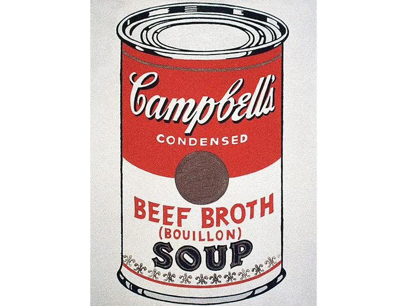
The next day, Warhol—or his mother, in one telling—ran to the Finast supermarket across the street and bought every variety of Campbell’s Soup that it carried; he later checked this inventory for completeness against a list he got from the soupmaker.
The whole story sounds as apocryphal as most of the other origin stories connected to Warhol—except that one biographer claims to have seen the actual check Warhol wrote to Latow.
If Warhol wanted a “recognizable” product of certifiably popular culture to turn into fancy art, Campbell’s Soup seemed likely to beat even Superman and Popeye—and to get him out from under the shadow of Lichtenstein at the same time.
In Warhol’s commercial career, photography’s sheer ability to present us with stuff had doomed his stylish, hand-drawn illustrations. So Warhol took photography’s directness and turned it into fine art. He got his old boyfriend Ed Wallowitch, a skilled photographer, to give him shots of soup cans in every state: pristine and flattened, closed and opened, single and stacked. And then, for something like the following year, the front room at the top of his town house saw him meticulously hand-painting those products onto canvases of every size. His goal was to make his soup paintings look as plain and direct as he possibly could, as though the cans had leaped straight from the supermarket shelf, or the kitchen counter or trash, onto his canvases. But in fact he had to come up with all kinds of clever techniques to get that effect, cutting stencils to get his product’s labels just right and mixing oil- and water-based paints to capture the speckled look of a can’s tarnished tin. The sheer perfection of his tarnished metal shows Warhol, so busy pretending to cut all ties to craft and tradition, becoming the latest in an ancient line of trompe l’oeil painters, the most craft-obsessed and conservative of all Western artists.
Nevertheless, when Warhol told Leila Davies, an old college friend, about his brand-new Campbell’s paintings, she was distraught at the waste of the talents he’d acquired in art school: “They just seemed like about as vacuous a statement as you could make as far as painting was concerned,” she said, echoing the feelings of his other ’50s friends. Warhol, however, was not to be discouraged: “Oh it’s the latest thing, the latest thing!” he told her. “You just take something very ordinary, and this is going to be the end thing and it is just gonna take off like a rocket.”
He was right, it did—and in the process it exploded almost every notion of what art should be and what an artist should do.
If Picasso had radically altered the look of fine art, Warhol did him one better by challenging its fundamental nature and status: Was an artist who merely reproduced the fronts of soup cans descending to the level of a labelmaker—or, worse, of a mere copyist—or could appropriation, as an artistic gesture, trump any actual gesture an artist might make with hand and brush? Could a “serious” artist risk going down into the trenches of popular culture—as Warhol went on to do in his Silver Factory and then in two more decades of tabloid headlines—and have that descent count as a successful move in the chess game of high art? Those questions still vex every artist today, from certified stars such as Damien Hirst and Jeff Koons to the latest art school graduates. Like it or not, Warhol’s silver wig still sits atop our culture.
Adapted from Warhol, by Blake Gopnik. Published April 2020 by Ecco. Reprinted with permission from The Wylie Agency, LLC.
Virtuoso of Vinyl
Warhol designed dozens of distinctive album covers. Click on the cover art to learn more about the selected albums below.—Ted Scheinman
Record image credit: Alamy
A Note to our Readers
Smithsonian magazine participates in affiliate link advertising programs. If you purchase an item through these links, we receive a commission.