How Newton, Goethe, an Ornithologist and a Board Game Designer Helped Us Understand Color
A new exhibition at the Cooper Hewitt Design Museum explores the kaleidoscope of figures who shaped color theory
/https://tf-cmsv2-smithsonianmag-media.s3.amazonaws.com/accounts/headshot/Alex_Palmer_lowres.jpg)
:focal(1199x799:1200x800)/https://tf-cmsv2-smithsonianmag-media.s3.amazonaws.com/filer/76/5d/765d3bea-9024-4459-8447-ed9dc984b28b/color3.jpg)
What is color? The question seems so fundamental that it’s almost impossible to answer—either so simple that it is difficult to define, or so complex that it would take volumes.
“Color, even though we all feel like we know what it is, when you try to start defining it, you can find it very mysterious and complex,” says Jennifer Cohlman Bracchi of Smithsonian Libraries. “Is it a physical thing? Is it a perceptual thing? Is it both?”
These questions are tackled by Bracchi and her co-curator, Susan Brown, associate curator of textiles at the Cooper Hewitt, Smithsonian Design Museum in the museum's new exhibition, "Saturated: The Allure and Science of Color."
To explain how we perceive and understand color, the exhibition showcases almost 200 objects, from a 19th century peacock-feather fan to an iMac computer, drawn from the museum's vast design collections. Helping to give context to these objects is a gallery of about three dozen rare books from Smithsonian Libraries, which represent the key thinkers who helped us see colors in new ways—scientific, philosophical, artistic, even musical. “Their approaches were all trying to solve their own kinds of problems,” says Bracchi.
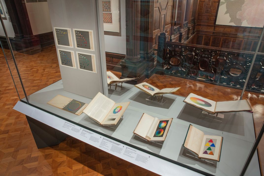
One of the oldest books in the exhibition is the 1704 first edition of Sir Isaac Newton’s Opticks, or, A Treatise of the Reflections, Refractions, Inflections and Colours of Light. The famed scientist lays out his findings from experiments in passing light through prisms and onto mirrors—and includes the first scientifically based color wheel. Bucking conventional wisdom that light is essentially white and then altered by matter to create different hues, he showed that light is made of different hues to begin with—red, orange, yellow, green, blue, indigo and violet—and colors are created from different mixtures of these.
His scientific approach fell flat with artists and designers of the era.
“Artists understood color using pigments—additive and subtractive color mixing,” says Bracchi. “So it’s shocking to most that the primary colors of lights are not the same.”
Another figure who had a major impact on the understanding of color is German writer Johann Wolfgang von Goethe. In 1810, his Zur Farbenlehr (“Theory of colors”), which is included in the exhibition, challenged Newton’s ideas about color and light, suggesting that color was not just a matter of scientific measurement but was often subjective, impacted by individual perception and surroundings.
“It was considered the first psychological and physiological treatise around color theory,” says Bracchi.
Connecting to these ideas is the original 1839 edition of industrial chemist and color theorist Michel Eugène Chevreul’s The Law of Simultaneous Contrasts. It introduced new ideas about how the color of two different objects can affect each other—for example, the same shade of gray may appear lighter or darker depending on the background color on which it’s placed. While these concepts had an impact on a wide range of fields, they grew out of a very practical assignment from a French textile manufacturer frustrated by the murkiness of its dyes.
/https://tf-cmsv2-smithsonianmag-media.s3.amazonaws.com/filer/e2/b9/e2b9ffeb-01a1-46c0-a77f-943e7a3873c2/color1.jpg)
“After he studied their dyes and their tapestry weaves, he realized it wasn’t the fault of the dye at all but rather the interweaving of the colors and the juxtaposing of different colors that mix before your eyes and create a dull effect,” says Bracchi.
Chevreul’s concept of simultaneous contrasts would influence Impressionists and post-Impressionists such as the pointillist Georges Seurat.
“When you juxtapose colors, particularly those that are far apart on the color wheel, increase the chromaticness of the other—the reds appear redder and the greens appear greener when they’re used in combination with each other,” says Brown.
The canon of color theorists also includes a board game pioneer and an ornithologist.
As synthetic dyes became more widely produced in the 1800s, it became necessary to develop a more consistent system to classify color. Milton Bradley, a famed maker of board games who also manufactured crayons and art supplies, outlines in his book Elementary Color how color sensitivity is something that is learned.
“He kind of equated it with learning music—as a child, if you learned color, you would become more gifted later in life,” says Bracchi.
/https://tf-cmsv2-smithsonianmag-media.s3.amazonaws.com/filer/8d/c0/8dc060ed-96b7-4389-8e90-50e3a7c7952f/color4.jpg)
He based his standards on spinning colored discs, providing a device that allowed people to do this at home.
Smithsonian’s first ornithologist, Robert Ridgeway, built on Bradley’s approach of creating a system of naming colors—applying it to his particular discipline, of course.
“Like many naturalists, he used color as an identification tool for the different species and he was not satisfied with the standards that came before that he was using, so he developed his own,” says Bracchi. Smithsonian holds the archives of his color studies, including colored discs.
Scientific developments through the late 19th and into the 20th centuries led to more innovative ways of identifying and measuring color. English chemist Henry Roscoe discovered that when you burn an element cleanly using a Bunsen burner, you are able to get a reading using a spectrometer, creating what Bracchi calls “a unique spectral fingerprint” for each color. The spectrometer led to spectrophotometer—an instrument for measuring the intensity of light within a spectrum.
German artist Joseph Albers made a huge impact on color theory with the publication of his Interaction of Color in 1963, which speaks to the measurement of color and the way we understand it, using tools like spectrophotometers. A plate from that initial publication is included in the show.
Albers’ influence is reflected in objects included in the show, which play on his ideas, such as after-image (the effect that occurs after you look at the sun and look away, leaving a psychedelic appearance) with items such as a fluorescent 1967 poster for The Miller Blues Band.
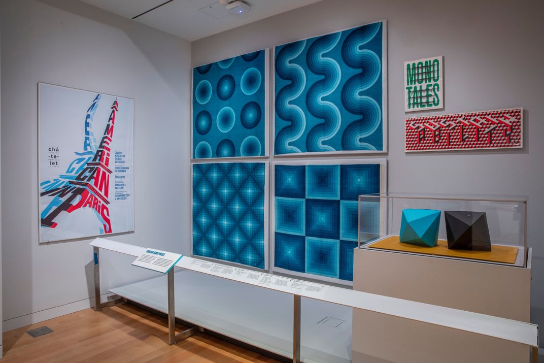
“Those colors appear to emit light even though they are not really,” says Brown.
The diversity of influencers on our understanding of color is a theme throughout the objects portion of the show, with designers, marketers, scientists and homemakers all represented. For example, the first synthetic dye was invented in 1856 by a teenage chemist named William Henry Perkin, who was trying to find a cure for malaria.
“He left his medical pursuits behind and opened a textile dye manufacturer,” says Brown. This led to an explosion of synthetic dyes and materials—“the realization that you could use petroleum waste product and build your own molecules from the ground up revolutionized our world.”
Another section looks at consumer choice—how color is used by marketers and designers to attract particular consumer segments or convey certain messages. Yellow fabric from the back of a 1957 Ford Fairlane 500, for example, was a luxury interior option during the suburban boom, as were designs directed at appealing to fashion-forward women. Or the iMac, where “we’re trying to disrupt perception of a particular class of object—to say the computer is not just a piece of office equipment but a desirable thing you might want in your own home for personal use,” as Brown puts it.
Government officials and city planners have even had a role to play in the evolution of color. As color-coded stoplights demonstrate, color provides important navigational information and one section of Saturated looks at color as a layer of information in mapping, infographics, road signage and more. This includes the 1974 Massimo Vignelli version of the New York City subway map, which color-coded the subway lines for the first time, making it much easier for riders.
As Brown puts it, “There are lots of different ways color can help clarify how different objects are used or provide a hierarchy of information, letting you know what the most important thing is.”
"Saturated: The Allure and Science of Color" is on view at the Cooper Hewitt, Smithsonian Design Museum in New York City at 2 East 91st Street, through January 13, 2019.
/https://tf-cmsv2-smithsonianmag-media.s3.amazonaws.com/accounts/headshot/Alex_Palmer_lowres.jpg)