What’s Over the Horizon? These New Maps Will Show You
Andy Woodruff’s line of sight maps show what you’re facing from any coastline in the world
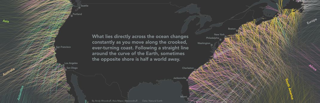
Walking along a rocky beach in New England, it’s fun to think that if you followed a straight path over the horizon you’d eventually end up in Spain or the coast of France. Except, that’s probably thousands of miles off. A new project by Boston-based cartographer Andy Woodruff of Axis Maps shows exactly where you’re looking from any coast in the world, and the answers are sometimes surprising.
According to his blog, the project, called Beyond the Sea, began when Woodruff saw a map in The Washington Post in 2014, showing what countries in the world are at equal latitudes. That got him thinking. First he wanted to see if there was a line that circles the entire earth without hitting land (there wasn’t).
Then he had another question. “Standing on a given point and facing perpendicular to the coast, if you went straight ahead, never turning, where would you end up?” he writes.
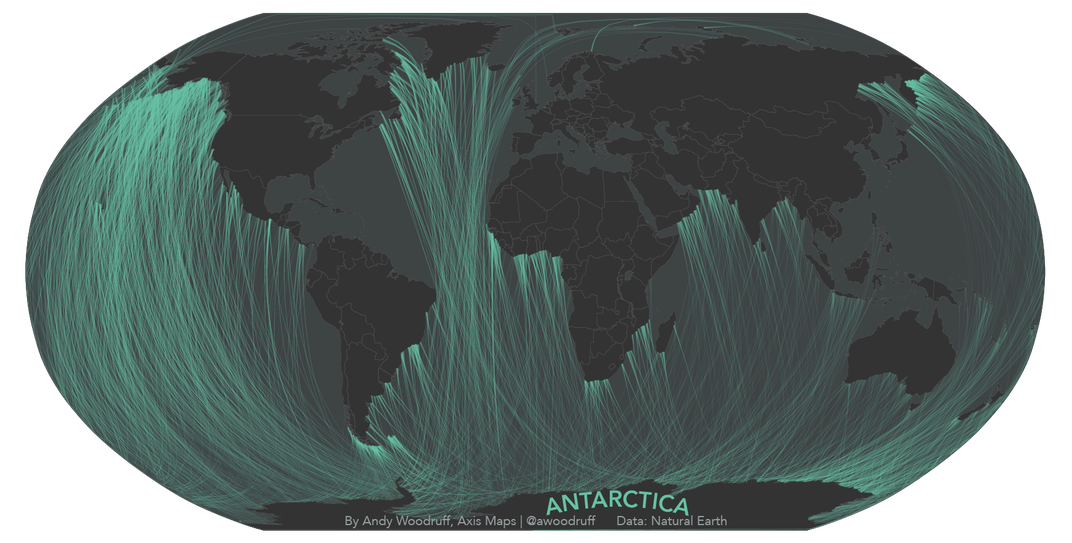
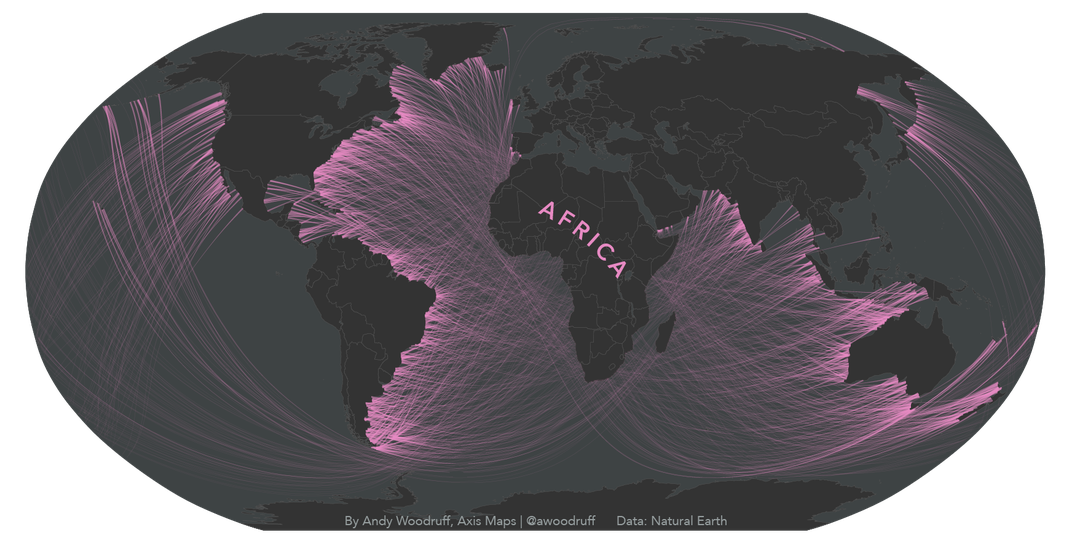
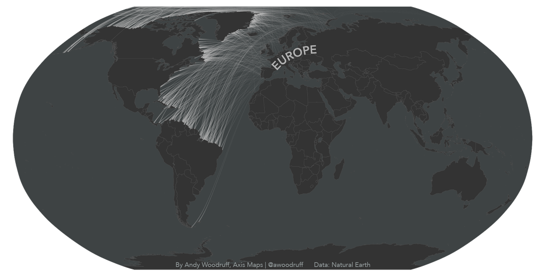
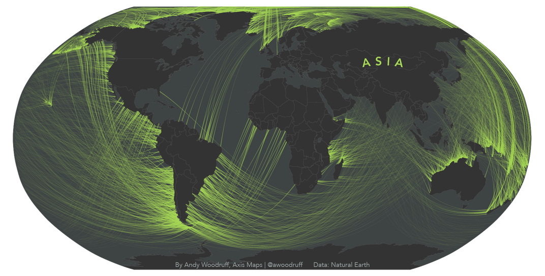
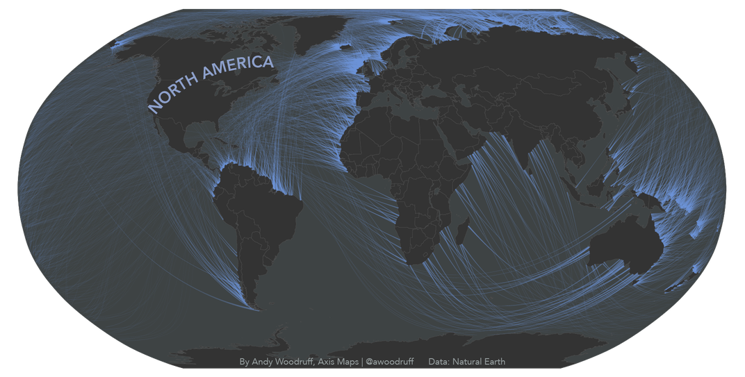
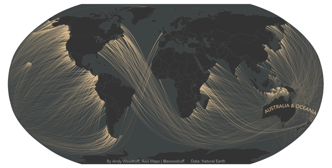
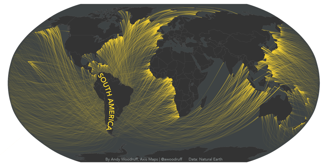
Because coastlines are crooked and the earth is round, the answer is sometimes not intuitive. Following the shortest, straightest line on a sphere known as a “great circle,” Woodruff’s series of maps show many lines of sight that are not obvious when looking at a 2-D map. For instance, the line of sight from a lighthouse in Newfoundland may stretch all the way to Australia. A map he did for Boston.com shows that nearby beaches point at Spain, Nova Scotia, Morocco and even South America.
“I spend a lot of time in summers at the Jersey Shore,” he tells Liz Stinson at WIRED. “It’s the East Coast, so you think, oh, it faces East, but really a lot of where we are faces southeast, and if you get a particularly rugged piece of coast it faces every which way…we need to see what direction the coast faces at that point, then draw a great circle in that direction and see what it runs into.”
Woodruff’s 2-D interpretations use the Robinson projection map that deforms landmasses near the poles while maintaining more natural proportions near the Equator. This means that lines on his maps, which detail the view from coasts on each continent including Antarctica, curve more dramatically at the edges.
While the project is more of an amusing lark than a hardcore research project (Woodruff admits some of his math may be wrong) it’s a good reminder that the maps in our head may not correspond with the curves of the real world. “It was fun for me as a general geography lesson,” Woodruff tells Stinson. “I found it revealing about the roundness of the earth, even as a cartographer I don’t necessarily visualize very well.”