This Map Shows Where All That Carbon Dioxide Is Coming From
Global carbon emissions have an obvious bias
/https://tf-cmsv2-smithsonianmag-media.s3.amazonaws.com/accounts/headshot/smartnews-colin-schultz-240.jpg)
/https://tf-cmsv2-smithsonianmag-media.s3.amazonaws.com/filer/01/ec/01ecbfc0-5056-4d80-9895-4e3d13f715bd/09_12_2014_new_york.jpg)
One of the big problems with climate change is that carbon dioxide is invisible. It's hard to notice something you can't see. Because if carbon dioxide were visible, the eastern U.S. and western Europe would be choking on the stuff worse than Londoners choked on coal soot in the 1800s.
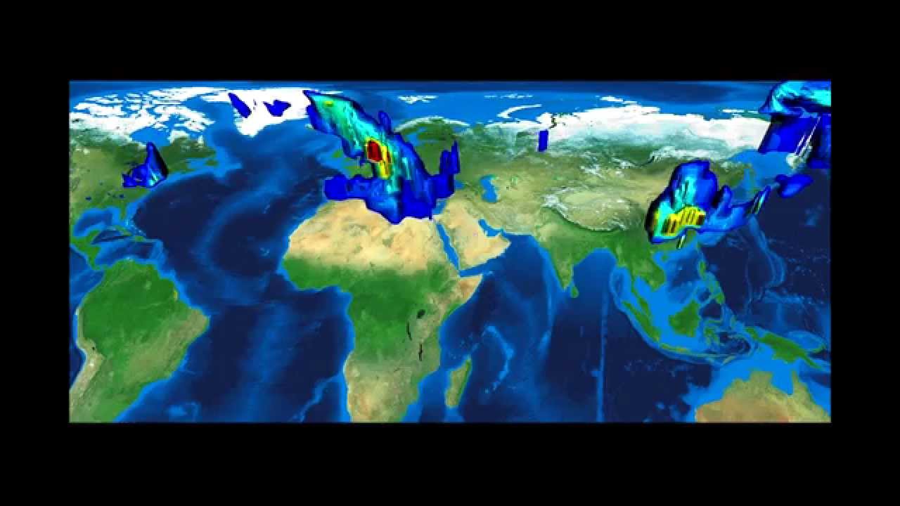
You're probably aware that western countries account for most of the world's greenhouse gas emissions. But actually seeing it, as in the map below, makes that notion perfectly clear. The map shows the world's carbon emissions from 1997 to 2010, say the scientists who made it. The data came from satellite measurements and reported emissions rates from factories and power plants, among other sources.
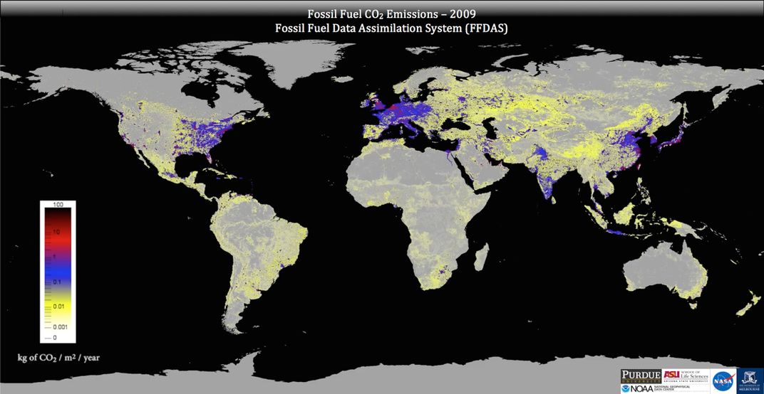
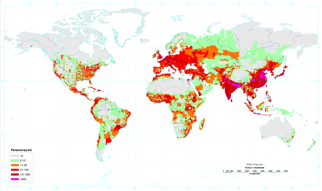
The massive population centers in Asia and South America are conspicuously missing.
According to Kevin Gurney, one of the scientists behind the map, their carbon emission monitoring system could be used to independently verify how much carbon dioxide various places are emitting:
/https://tf-cmsv2-smithsonianmag-media.s3.amazonaws.com/accounts/headshot/smartnews-colin-schultz-240.jpg)