Images on Cigarette Packs Are Scarier to Smokers Than Text Warnings
A new study shows that nothing scares a smoker away from taking another puff more than a picture of how a body will look like after a lifetime of doing so
/https://tf-cmsv2-smithsonianmag-media.s3.amazonaws.com/accounts/headshot/joseph-stromberg-240.jpg)
/https://tf-cmsv2-smithsonianmag-media.s3.amazonaws.com/filer/20121114093201tobacco-pack-designs-small.jpg)
More than 40 countries around the world force cigarette companies to print graphic images of things like decaying teeth, open-heart surgeries and cancer patients on their packs, in an effort to discourage smoking by directly linking cigarettes with their most gruesome effects. The United States, however, is not one of these countries: The U.S. Food and Drug Administration unveiled graphic designs in November 2010, but repeated lawsuits by the tobacco industry have delayed implementation of the new warnings.
If and when the labels do hit, the images could go a long way towards continuing the decline in smoking rates across the country. That’s because, as new research demonstrates, seeing these images every time a person reaches for a pack is a more effective deterrent than a text-only warning. The research also indicates that the graphic warnings are especially powerful in discouraging low-health literacy populations from smoking—the one group in which smoking rates have remained stubbornly high over the past few decades.
The study, published yesterday in the American Journal of Preventive Medicine , was conducted by James Thrasher of the University of South Carolina and colleagues. A control group of 207 smokers saw text-only warning labels, while 774 smokers evaluated nine different graphic labels, both images proposed by the FDA and a selection of others currently used in foreign countries.
The smokers were asked to judge each label on a scale of one to ten for credibility, relevance and effectiveness. The results were unequivocal: The text-only warnings’ average ratings were mostly in the fives and sixes, while simpler text messages combined with striking graphics scored in the sevens and eights across the board.
These differences were especially large for the group the researchers called low-health literacy smokers–people with less education who are less likely to be knowledgeable about the risks of smoking. This group gave much higher ratings for credibility, in particular, to the labels that showed them the health problems that arise from smoking, rather than text labels that merely told them. “The present study provided the first direct test of the hypothesis that pictorial health warning labels work better than text-only labels among people with low health literacy,” Thrasher said in a statement.
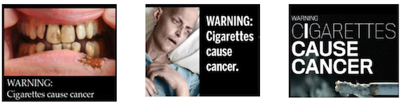
Among the labels with images, the study compared three different types: graphic (those that directly showed body parts damaged by smoking), human suffering (those that showed someone in a hospital bed, for example) and symbolic (more abstract images, such as a gravestone). Perhaps unsurprisingly, the first category was consistently rated as the most effective in discouraging smoking. It seems nothing so powerfully scares someone away from taking another puff than a picture of what their teeth, lungs or throat will look like after a lifetime of doing so.
Thrasher feels that these types of findings should be taken into account when agencies such as the FDA design cigarette warning labels, to be sure they reach all demographics. “The FDA should consider implementing warning labels with more graphic imagery in order to maximize the impact of warnings across different populations of adult smokers, including more disadvantaged smokers,” Thrasher said.
/https://tf-cmsv2-smithsonianmag-media.s3.amazonaws.com/accounts/headshot/joseph-stromberg-240.jpg)