When Republicans Were Blue and Democrats Were Red
The era of color-coded political parties is more recent than you might think
/https://tf-cmsv2-smithsonianmag-media.s3.amazonaws.com/filer/red-state-blue-state-election-carter-reagan2-631.jpg)
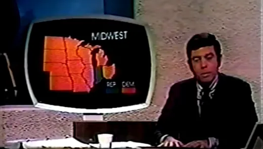
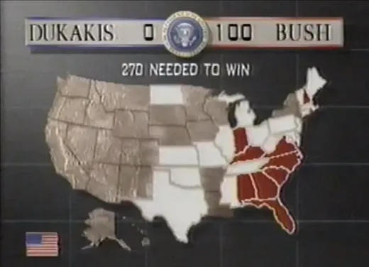
Television’s first dynamic, color-coded presidential map, standing two stories high in the studio best known as the home to “Saturday Night Live,” was melting.
It was early October, 1976, the month before the map was to debut—live—on election night. At the urging of anchor John Chancellor, NBC had constructed the behemoth map to illustrate, in vivid blue and red, which states supported Republican incumbent Gerald Ford and which backed Democratic challenger Jimmy Carter.
The test run didn’t go well. Although the map was buttressed by a sturdy wood frame, the front of each state was plastic.
“There were thousands of bulbs,” recalled Roy Wetzel, then the newly minted general manager of NBC’s election unit. “The thing started to melt when we turned all the lights on. We then had to bring in gigantic interior air conditioning and fans to put behind the thing to cool it.”
That solved the problem. And when election results flowed in Tuesday night, Nov. 2, Studio 8-H at 30 Rockefeller Center lit up. Light bulbs on each state changed from undecided white to Republican blue and Democratic red. NBC declared Carter the winner at 3:30 a.m. EST, when Mississippi turned red.
That’s right: In the beginning, blue was red and red was blue and they changed back and forth from election to election and network to network in what appears, in hindsight, to be a flight of whimsy. The notion that there were “red states” and “blue states”—and that the former were Republican and the latter Democratic—wasn’t cemented on the national psyche until the year 2000.
Chalk up another one to Bush v. Gore. Not only did it give us “hanging chads” and a crash course in the Electoral College, not only did it lead to a controversial Supreme Court ruling and a heightened level of polarization that has intensified ever since, the Election That Wouldn’t End gave us a new political shorthand.
Twenty years later, in a vitriolic presidential race shaped by the Covid-19 pandemic and a growing divide between liberal and conservative Americans, former Democratic Vice President Joe Biden is ahead in the polls and forecasts. Come November 3, pundits predict that the West Coast, the Northeast and parts of the upper Midwest will likely be bathed in blue. The country’s geographic center, meanwhile, will likely be awash in red. As evidenced by the 2016 presidential election, forecasts are just that. Ultimately, a handful of battleground states—including Florida, Georgia, Pennsylvania and Arizona—will determine the winner, starting out in neutral tones before shifting, one by one, to red or blue. If enough of these battleground states turn red, President Donald Trump will remain in the White House four more years. If enough become blue, Biden will move in on January 20, 2020. For now, they are considered “purple.”
Here’s something else we know: All the maps—on TV stations and Web sites election night and in newspapers the next morning—will look alike. We won’t have to switch our thinking as we switch channels, wondering which candidate is blue and which is red. Before the epic election of 2000, there was no uniformity in the maps that television stations, newspapers or magazines used to illustrate presidential elections. Pretty much everyone embraced red and blue, but which color represented which party varied, sometimes by organization, sometimes by election cycle.
There are theories, some likely, some just plain weird, to explain the shifting palette.
“For years, both parties would do red and blue maps, but they always made the other guys red,” said Chuck Todd, political director and chief White House correspondent for NBC News. “During the Cold War, who wanted to be red?”
Indeed, prior to the breakup of the Soviet Union little more than two decades ago, “red was a term of derision,” noted Mitchell Stephens, a New York University professor of journalism and author of A History of News.
“There’s a movie named Reds, ” he said. “You’d see red in tabloid headlines, particularly in right wing tabloids like the Daily Mirror in New York and the New York Daily News.”
Perhaps the stigma of red in those days explains why some networks changed colors— in what appeared to be random fashion—over the years. Kevin Drum of the Washington Monthly wrote in 2004 that the networks alternated colors based on the party of the White House incumbent, but YouTube reveals that to be a myth.
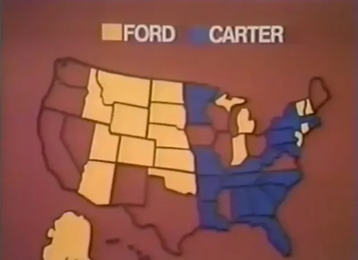
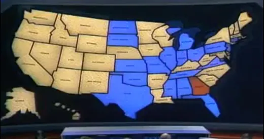
Still, there were reversals and deviations. In 1976, when NBC debuted its mammoth electronic map, ABC News employed a small, rudimentary version that used yellow for Ford, blue for Carter and red for states in which votes had yet to be tallied. In 1980, NBC once again used red for Carter and blue for the Republican challenger, Ronald Reagan, and CBS followed suit. But ABC flipped the colors and promised to use orange for states won by John Anderson, the third-party candidate who received 6.6% of the popular vote. (Anderson carried no states, and orange seems to have gone by the wayside.) Four years later, ABC and CBS used red for Republicans and blue for Democrats, but the combination wouldn’t stick for another 16 years. During the four presidential elections Wetzel oversaw for NBC, from 1976 through 1988, the network never switched colors. Republicans were cool blue, Democrats hot red.
The reasoning was simple, he said: Great Britain.
“Without giving it a second thought, we said blue for conservatives, because that’s what the parliamentary system in London is, red for the more liberal party. And that settled it. We just did it,” said Wetzel, now retired.
Forget all that communist red stuff, he said. “It didn’t occur to us. When I first heard it, I thought, ‘Oh, that’s really silly.’ ”
When ABC produced its first large electronic map in 1980, it used red for Republicans and blue for Democrats, while CBS did the reverse, according to Wetzel. NBC stuck with its original color scheme, prompting anchor David Brinkley to say that Reagan’s victory looked like “a suburban swimming pool.”
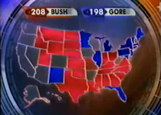
Newspapers, in those days, were largely black and white. But two days after voters went to the polls in 2000, both the New York Times and USA Today published their first color-coded, county-by-county maps detailing the showdown between Al Gore and George W. Bush. Both papers used red for the Republican Bush, blue for the Democrat Gore.
Why?
“I just decided red begins with ‘r,’ Republican begins with ‘r.’ It was a more natural association,” said Archie Tse, senior graphics editor for the Times. “There wasn’t much discussion about it.”
Paul Overberg, a database editor who designed the map for USA Today, said he was following a trend: “The reason I did it was because everybody was already doing it that way at that point.”
And everybody had to continue doing it for a long time. The 2000 election dragged on until mid-December, until the Supreme Court declared Bush the victor. For weeks, the maps were ubiquitous.
Perhaps that’s why the 2000 colors stuck. Along with images of Florida elections officials eyeballing tiny ballot chads, the maps were there constantly, reminding us of the vast, nearly even divide between, well, red and blue voters.
From an aesthetic standpoint, Overberg said, the current color scheme fits with the political landscape. Republicans typically dominate in larger, less populated states in the Plains and Mountain West, meaning the center of the United States is very red. “If it had been flipped, the map would have been too dark,” he said. “The blue would have been swamping the red. Red is a lighter color.”
But not everyone liked the shift. Republican operative Clark Bensen wrote an analysis in 2004 titled “RED STATE BLUES: Did I Miss That Memo?”
“There are two general reasons why blue for Republican and Red for Democrat make the most sense: connotation and practice,” Bensen wrote. “First, there has been a generally understood meaning to the two colors inasmuch as they relate to politics. That is, the cooler color blue more closely represented the rational thinker and cold-hearted and the hotter red more closely represented the passionate and hot-blooded. This would translate into blue for Republicans and red for Democrats. Put another way, red was also the color most associated with socialism and the party of the Democrats was clearly the more socialistic of the two major parties.
“The second reason why blue for Republicans makes sense is that traditional political mapmakers have used blue for the modern-day Republicans, and the Federalists before that, throughout the 20th century. Perhaps this was a holdover from the days of the Civil War when the predominantly Republican North was ‘Blue’.”
At this point—five presidential elections after Bush v. Gore—the color arrangement seems unlikely to reverse any time soon. Not only have “red states” and “blue states” entered the lexicon, partisans on both sides have taken ownership of them. For instance, RedState is a conservative blog; Blue State Digital, which grew out of Democrat Howard Dean’s 2004 presidential campaign, helps candidates and organizations use technology to raise money, advocate their positions and connect with constituents. In 2008, a Republican and a Democrat even joined forces to create Purple Strategies, a bipartisan public affairs firm.
Sara Quinn, a visual journalist now at the Poynter Institute in Florida, said she sees no particular advantage to either color.
“Red is usually very warm and it comes forward to the eye. Blue tends to be a recessive color, but a calming color,” she said.
Not that anyone thought of those things when assigning colors in 2000. Not that they think about it at all today.
“After that election the colors became part of the national discourse,” said Tse. “You couldn’t do it any other way.”