The Surprising History of the Infographic
Early iterations saved soldiers’ lives, debunked myths about slavery and helped Americans settle the frontier
/https://tf-cmsv2-smithsonianmag-media.s3.amazonaws.com/accounts/headshot/Clive_Thompson_photo_credit_is_Tom_Igoe.jpg)
/https://tf-cmsv2-smithsonianmag-media.s3.amazonaws.com/filer/65/55/6555e4a2-5ec6-4ddb-a930-24ad216af0e9/julaug2016_h03_col_clive.jpg)
As the 2016 election approaches, we’re hearing a lot about “red states” and “blue states.” That idiom has become so ingrained that we’ve almost forgotten where it originally came from: a data visualization.
In the 2000 presidential election, the race between Al Gore and George W. Bush was so razor close that broadcasters pored over electoral college maps—which they typically colored red and blue. What’s more, they talked about those shadings. NBC’s Tim Russert wondered aloud how George Bush would “get those remaining 61 electoral red states, if you will,” and that language became lodged in the popular imagination. America became divided into two colors—data spun into pure metaphor. Now Americans even talk routinely about “purple” states, a mental visualization of political information.
We live in an age of data visualization. Go to any news website and you’ll see graphics charting support for the presidential candidates; open your iPhone and the Health app will generate personalized graphs showing how active you’ve been this week, month or year. Sites publish charts showing how the climate is changing, how schools are segregating, how much housework mothers do versus fathers. And newspapers are increasingly finding that readers love “dataviz”: In 2013, the New York Times’ most-read story for the entire year was a visualization of regional accents across the United States. It makes sense. We live in an age of Big Data. If we’re going to understand our complex world, one powerful way is to graph it.
But this isn’t the first time we’ve discovered the pleasures of making information into pictures. Over a hundred years ago, scientists and thinkers found themselves drowning in their own flood of data—and to help understand it, they invented the very idea of infographics.
**********
The idea of visualizing data is old: After all, that’s what a map is—a representation of geographic information—and we’ve had maps for about 8,000 years. But it was rare to graph anything other than geography. Only a few examples exist: Around the 11th century, a now-anonymous scribe created a chart of how the planets moved through the sky. By the 18th century, scientists were warming to the idea of arranging knowledge visually. The British polymath Joseph Priestley produced a “Chart of Biography,” plotting the lives of about 2,000 historical figures on a timeline. A picture, he argued, conveyed the information “with more exactness, and in much less time, than it [would take] by reading.”
Still, data visualization was rare because data was rare. That began to change rapidly in the early 19th century, because countries began to collect—and publish—reams of information about their weather, economic activity and population. “For the first time, you could deal with important social issues with hard facts, if you could find a way to analyze it,” says Michael Friendly, a professor of psychology at York University who studies the history of data visualization. “The age of data really began.”
An early innovator was the Scottish inventor and economist William Playfair. As a teenager he apprenticed to James Watt, the Scottish inventor who perfected the steam engine. Playfair was tasked with drawing up patents, which required him to develop excellent drafting and picture-drawing skills. After he left Watt’s lab, Playfair became interested in economics and convinced that he could use his facility for illustration to make data come alive.
“An average political economist would have certainly been able to produce a table for publication, but not necessarily a graph,” notes Ian Spence, a psychologist at the University of Toronto who’s writing a biography of Playfair. Playfair, who understood both data and art, was perfectly positioned to create this new discipline.
In one famous chart, he plotted the price of wheat in the United Kingdom against the cost of labor. People often complained about the high cost of wheat and thought wages were driving the price up. Playfair’s chart showed this wasn’t true: Wages were rising much more slowly than the cost of the product.
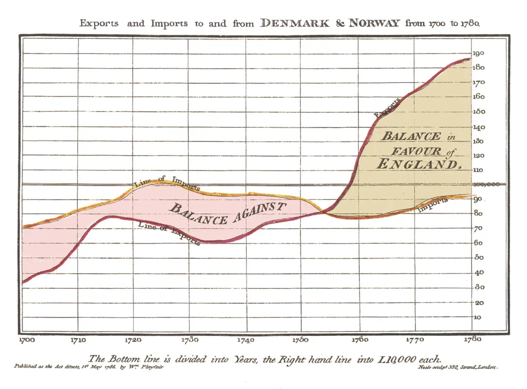
“He wanted to discover,” Spence notes. “He wanted to find regularities or points of change.” Playfair’s illustrations often look amazingly modern: In one, he drew pie charts—his invention, too—and lines that compared the size of various country’s populations against their tax revenues. Once again, the chart produced a new, crisp analysis: The British paid far higher taxes than citizens of other nations.
Neurology was not yet a robust science, but Playfair seemed to intuit some of its principles. He suspected the brain processed images more readily than words: A picture really was worth a thousand words. “He said things that sound almost like a 20th-century vision researcher,” Spence adds. Data, Playfair wrote, should “speak to the eyes”—because they were “the best judge of proportion, being able to estimate it with more quickness and accuracy than any other of our organs.” A really good data visualization, he argued, “produces form and shape to a number of separate ideas, which are otherwise abstract and unconnected.”
Soon, intellectuals across Europe were using data visualization to grapple with the travails of urbanization, such as crime and disease. In France in the 1830s, a lawyer named André-Michel Guerry created maps showing “moral statistics.” He was among the first to use shadings to show data—darker where crime was worse or illiteracy higher, for example. His maps were controversial, because they rebutted conventional wisdom. French social critics believed that lower education led to crime, but the maps suggested this wasn’t true. “Clearly,” Guerry wrote, “the relationship people talk about does not exist.” Data-based social science was born.
By the middle of the 19th century, “moral statistics” were booming and scientists were using data visualization to quash epidemics. When cholera ravaged London in 1854, the physician John Snow mapped out incidences, and noticed a large cluster around the water pump on Broad Street. The skeptical city council closed the pump, the epidemic subsided, and Snow’s map helped nudge forward a crucial idea: that diseases could be caused by contact with an as-yet-unknown contagion—bacteria.
**********
In mid-19th-century America, one of the biggest social issues was slavery. And it was slavery that propelled some of the country’s most remarkable data visualizations: “slave maps.”
When Southern states began to secede in 1860 and 1861, Union forces invaded Virginia to try to beat back the secessionists. But where should they concentrate their forces? In the midst of the fighting in June 1861, the federal government’s Coast Survey department produced a fascinating map of Virginia that suggested a strategy. Using data from the latest census, the map showed the concentration of slaves in each county of Virginia: The darker the county, the higher the percentage of the population enslaved.
One trend immediately jumped out: eastern Virginia was the hotspot of slavery. The western region was comparatively slave-free. This suggested that the west would care less about fighting to preserve slavery; indeed, it might even switch sides and join the Unionists. The map was a deeply political data visualization, points out Susan Schulten, a historian at the University of Denver and author of Mapping the Nation. It was trying to show that only a relative minority of Virginians supported—and benefited from—slavery. It suggested military strategy, too: Try to pit the west against the east.
“It was a breakthrough map,” Schulten notes. “It was an attempt to influence how the government saw the nation, and how the military understood it. It drove Lincoln’s attention to where slavery was weakest.”
Soon after, the U.S. Coast Survey produced yet another map charting slave density, except this one covered all the Southern states. President Lincoln was fascinated by this map, consulting it so frequently during the Civil War that it showed “the marks of much service,” as an official portraitist, Francis Bicknell Carpenter, later recalled. One day Carpenter had borrowed the map to examine it, when Lincoln came into the room.
“You have appropriated my map, have you?” said Lincoln. “I have been looking all around for it.” The president put on his spectacles, “and sitting down upon a trunk began to pore over it very earnestly,” as Carpenter later wrote. Lincoln pointed to the position where Judson Kilpatrick’s cavalry division of the Army was now fighting Confederate troops. “It is just as I thought it was,” he said. “He is close upon ___County, where slaves are thickest. Now we ought to get a ‘heap’ of them, when he returns.” Much as with the Virginia map, Lincoln used the map to understand the country in a new way—to see where Southerners would be most, and least, eager to fight the North.
**********
By the late 19th century, data visualization had created a new type of citizen. Educated individuals in the U.S. or Europe were increasingly comfortable thinking statistically. “The two dominant words of our time,” wrote Oliver Wendell Holmes in 1860, “are law and average.”
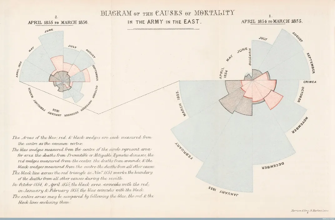
One true believer was the British nurse Florence Nightingale. As a child she was so bewitched by math that she organized information about her gardening in tables. Statistics, she said, were a tool to know “the thought of God”; when weary, a glance at a table of numbers was “perfectly reviving.”
During the Crimean War she got a chance to wield her data skills. While in the field, Nightingale became appalled at the squalid conditions of army hospitals and soldier barracks, which were mired with feces and vermin. She persuaded Queen Victoria to let her study the issue, and Nightingale teamed up with her friend William Farr, the country’s leading statistician, to analyze army mortality rates. They uncovered a stunning fact: Most of the soldiers in the Crimean War hadn’t died in combat. They’d died of “preventable diseases”—precisely the sort caused by terrible hygiene. Clean up the hygiene and you’d save lives.
Nightingale adroitly realized that tables of numbers and text would be too hard to parse. They needed, she said, a data visualization—“to affect thro’ the Eyes what we fail to convey to the public through their word-proof ears.” Her invention was the elegant “polar area chart,” a new variant of the pie chart: Each slice of the pie showed deaths for one month of the war, growing larger if the deaths increased, and color-coded to show the causes of death. Fans called it the “rose diagram,” because it looked like a flower.
The queen and Parliament could see at a glance the importance of hygiene; they quickly set up a sanitary commission to improve conditions, and death rates fell. Nightingale became one of the first people to successfully use data visualization for persuasion—to influence public policy.
“She was an activist and she wanted to make a difference,” says Lynn McDonald, a professor emeritus at the University of Guelph in Ontario and editor of The Collected Works of Florence Nightingale.
Visualization even governed how the U.S. territory expanded. Many Americans wanted to move westward, but elites were uncertain whether the interior was suitable for farming. Some believed it was a “Great American Desert”; Joseph Henry, a scientist and Secretary of the Smithsonian Institution, regarded the West as “a barren waste...unfit for agriculture,” and he produced maps analyzing Army rainfall data to support his contention. Others fired back with their own data visualizations arguing the opposite: Rainfall patterns in the West were cyclical, they argued, so the land there could certainly support grazing animals. The expansionists eventually won out. The vision of Manifest Destiny was built not just with speeches, but with infographics.
**********
This spring, the Wall Street Journal produced a fascinating data visualization titled “Blue Feed, Red Feed.” On the Journal’s website, “visual correspondent” Jon Keegan created an interactive page that shows what Facebook looks like for users who were “very liberal” or “very conservative.” Because Facebook’s newsfeed emphasizes stories friends are “liking,” people with lots of liberal friends tend to get shown lots of left-wing news, and vice versa. Keegan wanted to help readers see just how loud it was inside the echo chamber.
The results were stark: When you looked at the “blue feed,” it showed photos of a strong, resolute-looking Hillary Clinton. The “red feed” showed a post about “Hillary’s toxic plans for the Second Amendment” with the caption “downright evil.”
The age of data, it seems, has even created a new job: the data journalist, who’s comfortable not only making phone calls and writing stories, but writing code and crunching data. For the “Blue Feed, Red Feed” story, Keegan analyzed a large academic data set of Facebook postings. Thanks to programming languages like R or Python, today’s data journalists can make a data visualization on a daily deadline.
“It didn’t used to be even ten years ago that we could build a sophisticated data analysis at the same speed that someone can write a story,” says Scott Klein, a data journalist with ProPublica. “And now we can.” News outlets now often publish entire databases with a search interface, because readers enjoy poking around in the big river of data themselves.
“We can rely on a level of data literacy that we couldn’t rely on 100 years ago, or even 40 years ago,” Klein adds. Everyday people have tools to chart the info of their lives. Google, for example, recently upgraded its online spreadsheets application so that its users can automatically generate visualizations from any data they put inside.
The next step? Virtual reality. Alberto Cairo, a journalism professor at the University of Miami, imagines putting on a VR headset to read a report or watch TV, and watching visualizations swim around in front of him in 3-D. “How can you superimpose a data image over a real image?” he wonders. That’ll be the question for the William Playfairs of this century.

Mapping the Nation
/https://tf-cmsv2-smithsonianmag-media.s3.amazonaws.com/accounts/headshot/Clive_Thompson_photo_credit_is_Tom_Igoe.jpg)