These Watercolor Paintings Actually Include Climate Change Data
Jill Pelto, an artist and scientist, incorporates graphs of rising sea levels and soaring temperatures in her artwork
Climate change can be seen when a mountainside’s trees turn brown thanks to the burrowing of bark beetles, an insect population that explodes during drought, or when an iconic species is pushed closer to extinction. But some of its effects are obvious only to those who look for them. From decades’ worth of data, scientists build narratives about how the oceans are acidifying, the average temperatures are warming and the precipitation is becoming more extreme.
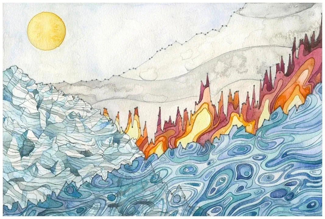
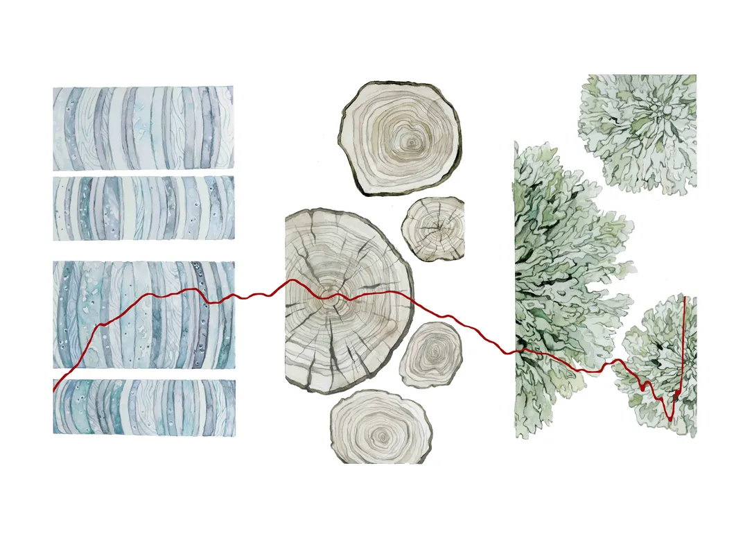
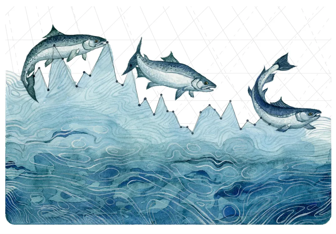
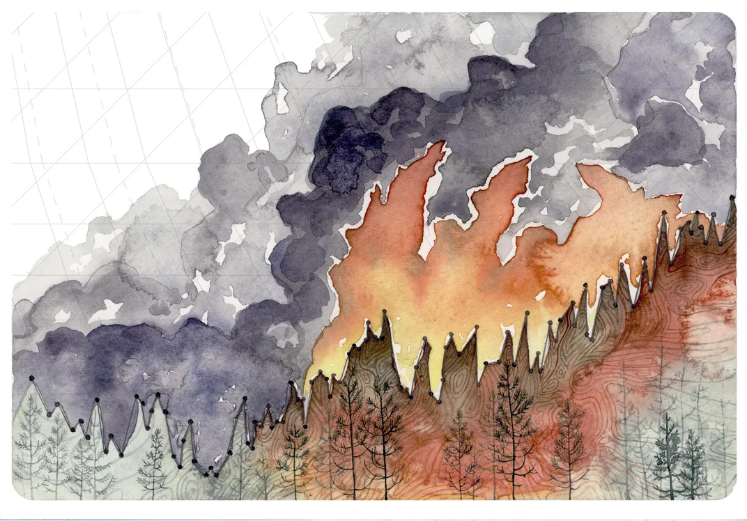
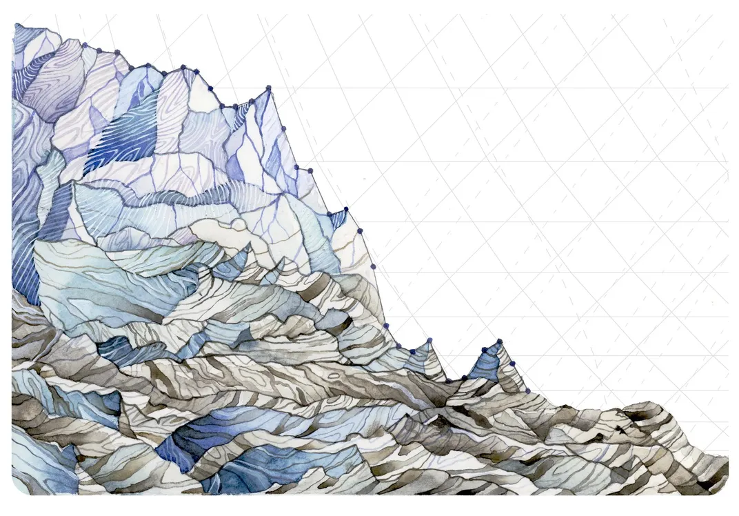
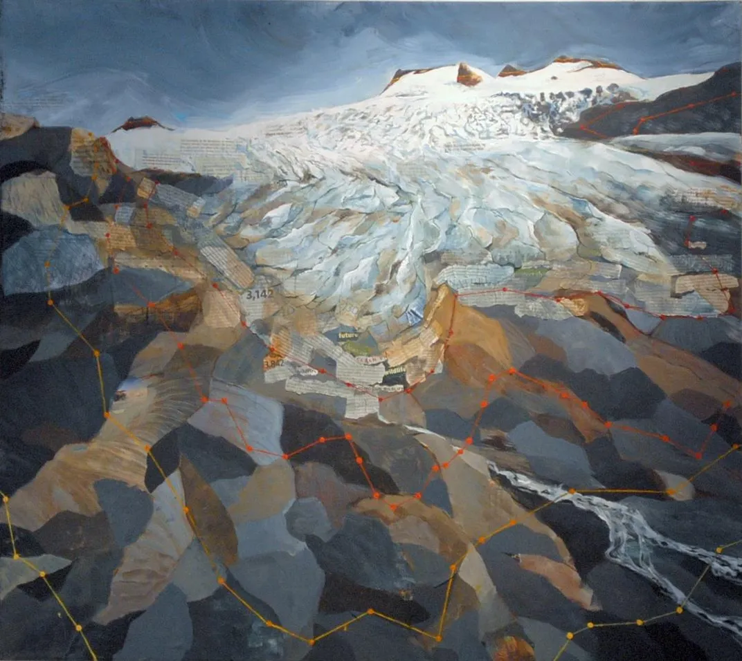
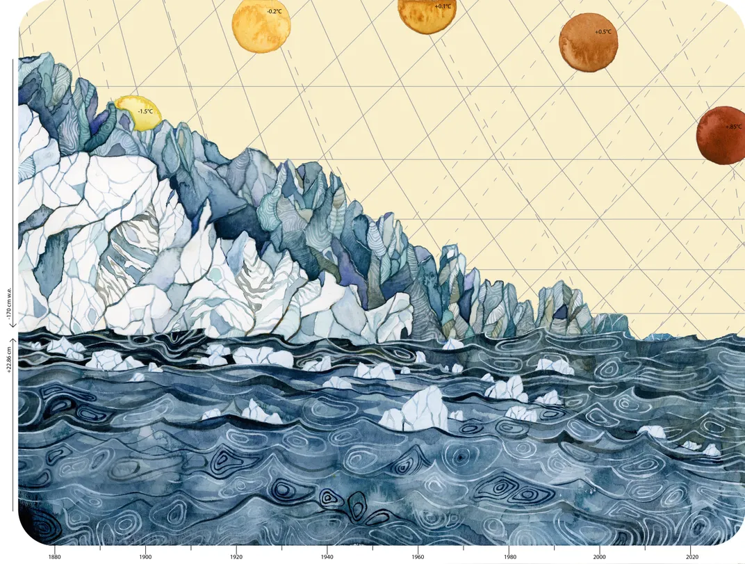
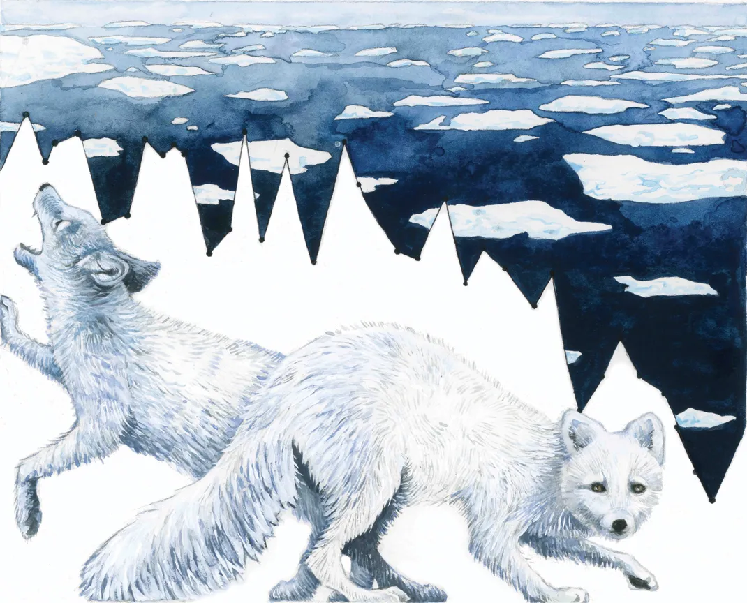
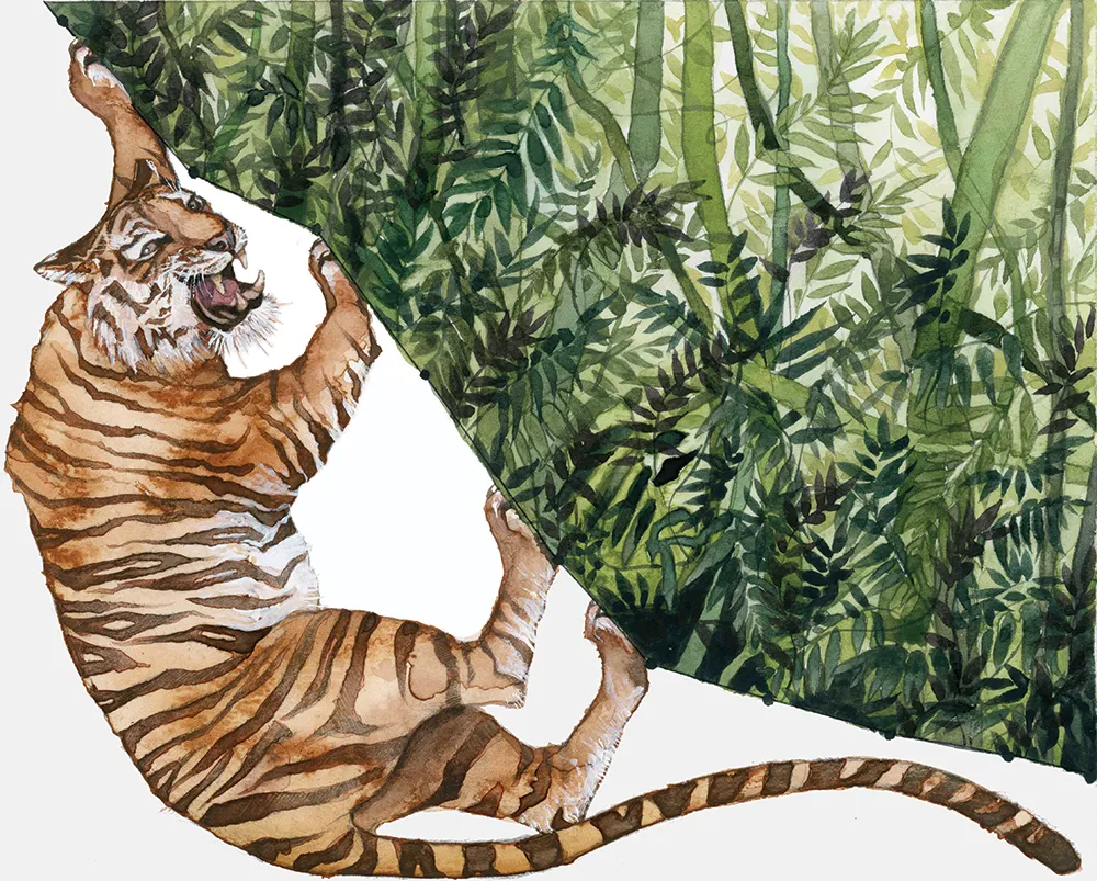
Jill Pelto, a recent graduate from the University of Maine, has made it her mission to communicate these changes. The 22-year-old artist paints vivid watercolors of mountains, glaciers, waves and animals, that on closer inspection, reveal jagged line graphs more commonly seen in the pages of a scientific journal than on a gallery’s walls. Pelto incorporates real scientific data into her art. In one piece, the silver bodies of Coho salmon dance over blue, rippled water filling a space under a falling graph line. The line connects data points that document the decline of snow and glacier melt that feed the rivers the fish inhabit. Another combines data that describe the rising of sea levels, the climbing demand for fossil fuels, the decline of glaciers and the soaring average temperatures. All of those line graphs lay one over another to create a landscape telling the story of climate change.
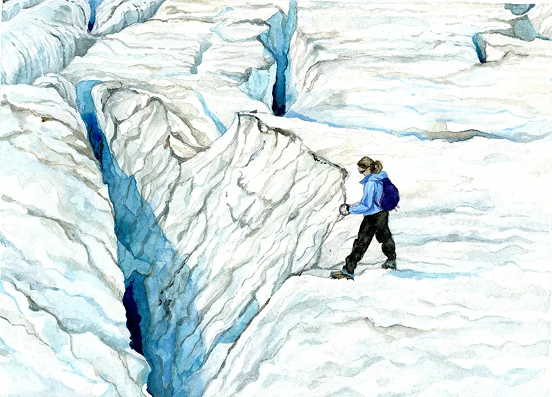
Mauri Pelto, Jill’s father, is a glaciologist and professor at Nichols College in Dudley, Massachusetts. When she was 16, Jill joined him in the mountains of Washington for a field season, measuring the depths of crevasses in the glaciers they tracked, recording the extent of snow and ice, and looking for other changes. The experience was life changing. She hiked up the North Cascades for six more field seasons and, in that time, witnessed the slow deaths of the mountains’ glaciers. Around the world, once intimidating bodies of ice and snow are ceasing their centuries-old movement and becoming static remnants of their former selves, pocked with melt-water pools and riddled with caves in the summer.
Now that she has earned her undergraduate degree in studio art and earth science, Pelto has plans to pursue a Master’s degree in climate science at the University of Maine next fall.
“I think the science evolved more from my love of the outdoors and caring about the environment, but the art was always supposed to be a part of my life,” she says. “I’ve always considered myself an artist first.”
I spoke with Pelto about her inspiration, her process and her desire to communicate the threats of climate change in a way that emotionally resonates with people.
Can you describe one of the most memorable experiences you had out in the field?
Everything about this past field season [late summer 2015] was striking. It was nothing like any of the others in many ways, due to climate change, due to the drought out West. Everything was different. There was virtually no snow left on the glacier, which was really odd to see. It was just all ice, which melts a lot faster. All the little ponds up there were really small, the reservoirs were depleted, but there were also more forming under the glaciers. I saw a huge lake forming there for the first time and that was really bizarre. It's weird, and sad.
Do you carry your art materials with you to the glaciers?
I take small stuff. I usually take a little watercolor sketchbook, a set of watercolors, some pencils. Fieldwork is usually in the morning, so in the late afternoon or early evening, I'll have time to do a watercolor and capture the different aspects of the landscape. During the summer, the sun doesn't set until pretty late.
When did you start including the graphs of climate data in your work?
I started doing that after this last trip to Washington, this past September. I've been struggling for a long time how to have an environmental message in my artwork. I've done sketches, but those are more just landscapes and memories for me. So they don't really tell a story.
I realized that people who are interested in science pay attention to graphs. I think they are a really good visual, but other people don't really pay attention to them. That was my first thought when I looked at a graph that my dad made of the decline in glaciers—it is a really good visual of how rapidly the volume of these glaciers has declined. I saw how I could use that as a profile of a glacier, incorporating a graph but giving an artistic quality to it. People can learn from the image because you are seeing actual information, but hopefully they are also emotionally affected by it.
Where do you find the data?
Sometimes I'll be reading something and I'll see a graph that I think will be good for a piece. Often, I'll have a particular topic and I'll want to create something about it, so I'll look for visuals. I'll research different scientific papers, but also different sites like NOAA or NASA, or sites that have climate news—reliable sites where I can find different graphs and decide which one I think represents and best communicates what's going on.
Do you have a favorite piece?
I like the piece on glacier mass balance, which was one of the three in the series I created after this most recent trip to Washington. It's my favorite just because I feel a very personal connection to those glaciers after working on them seven years.
Why is it important to you to use art to help communicate science?
I think that art is something that people universally enjoy and feel an emotional response to. People across so many disciplines and backgrounds look at and appreciate it, and so in that sense art is a good universal language. My target audience is in many ways people who aren't going to be informed about important topics, especially scientific ones.
What do you hope viewers take away from your work?
I hope to have both intellectual and emotional content in my artwork. I also hope to inspire people to make a difference about these topics. I haven't quite figured out how to do that yet. People have been responding to [these pieces], but I think they are more likely people who already think these topics are important. So I want to find some way to challenge people to do something with my art and make it more of an activist endeavor.
What’s next?
I have a lot of plans. Right now, I have a piece in progress about caribou populations. Another thing I'm trying to do is collaborate with other scientists. They can tell me what they are working on, what the data is and what it might mean for the future.
Jill Pelto’s work can be seen at her website. She also shares works-in-progress and completed pieces on her Instagram account.