Architects and Designers Make Money for Norway
Literally, that is. Two firms have been selected to design Norway’s new currency.
/https://tf-cmsv2-smithsonianmag-media.s3.amazonaws.com/accounts/headshot/Jimmy-Stamp-240.jpg)
/https://tf-cmsv2-smithsonianmag-media.s3.amazonaws.com/filer/9c/44/9c44da1b-d40e-4081-be3d-313b49fd474f/norway-money.jpg)
You can tell a lot about a country by looking at its money. The national figures, iconography and cultural institutions depicted on national currency, as well as its general design, are expressions of a country's values and heritage. Artist and designer Alphonse Mucha realized this when, in the wake of World War I, he designed banknotes for his native Czechoslovakia using distinctive organic forms rooted in local traditions. Consider also banknotes in the United States: the depictions of founding fathers and Neoclassical capital architecture alongside various symbols, signatures, and seals are, depending on your perspective, either celebrations of history and tradition or stubborn reminders of outmoded or lost ideals.
U.S. currency has evolved over time, but changes have been made for purposes of security, while aesthetic, accessibility, and cultural consideration seem to have been largely ignored. Norway, meanwhile, have changed their banknotes eight times since 1875, and the recently announced Series VIII notes are strikingly different from any previous versions.
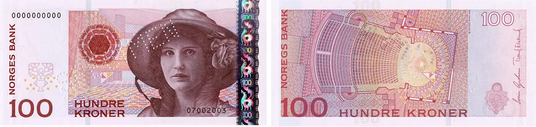
Norges Bank, the central bank of Norway, decided to redesign the country’s currency to combat increasingly sophisticated counterfeiters and while the bank itself will of course oversee the bills’ new security features, it launched a competition last spring to find a new artistic motif for the bills. The mandated theme was “The Sea,” in honor of “its importance for Norway's business sector and economic prosperity.” From the 70 submitted proposals, a jury made up of artists, historians, and bank executives selected two very different winning entries to give each new notes a duality of both traditional and modern expression.
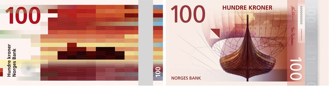
On the obverse, or "front," face, the Oslo-based graphic design firm The Metric System with Terje Tønnessen, created a a “typically Nordic” design that was found to be “very well suited to the incorporation of necessary security elements." A pixelated proposal by Norwegian architecture firm Snøhetta’s will be adopted for the reverse face.
In its selection, the jury considered representation of Norwegian culture, integration of security measures, good interrelationships among denominations, and the prominence high-contrast colors that make each bill easily distinguishable to the visually impaired (a long overdue feature in U.S. bills, which are embarrassingly similar to one another). While the Metric System Proposal scored very highly in all respects, it was seen as a little too traditional, and the bank intends to make changes to the design to “dampen the idyllic expression.”
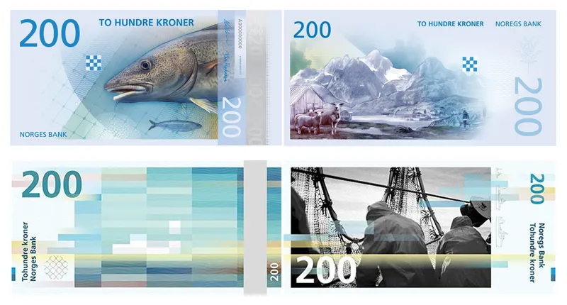
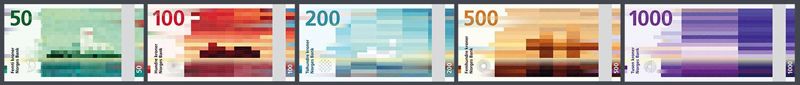
Snøhetta’s original proposal, dubbed “The Beauty of Boundaries,” is an abstraction of the country’s coastline, represented through a pixel mosaic--“our times’ visual language,” note the architects--that change with each denomination, stretching with larger bills in accordance to the Beaufort scale, which measures wind speed according to an estimation of the wind’s effects.
Snøhetta, as architects are wont to do, describe their proposal at greater length:
On the 50 NOK note the wind is gentle, represented by short, cubical shapes and long, tame waves in the organic pattern. On the 1000 NOK note the wind is strong, expressed through sharp long shapes on the cubes and short waves.
The pattern and the abstracted motives create a horizon. The horizon is perhaps the most used dramaturgy for expressing border crossings. The nuances are tied together by the horizon and overlapping in the pattern. Just as our cost, the different banknotes are connected. We have chosen black and white photos to enhance the colors of the cubical pattern, as well as to complement the Norwegian style and tone. The pictures contrast the rational system, and have motives with both direct and indirect storytelling. Our goal is to bring people into creating their own interpretations and associations. You will never know exactly what or how, but the design invites you into the beauty of boundaries – the transition between digital and analog, soft and hard – a dynamic that creates tension and life; just as the boundaries of our coast.
Notably, the Series VIII banknotes will be the country’s first series that doesn’t feature a portrait of a significant cultural figure. Instead, “The Sea” was selected as the theme to explore a wide range creative possibilities while creating a visually cohesive system of banknotes. While from a design perspective, it doesn’t seem ideal to Frankenstein together two completely disparate concepts, the two designs are united by the maritime theme and, together, manage to create something unique, a type of liminal condition uniting past and present where, as Snøhetta says, “something meaningful and interesting happens.” Over the next few years, the designs will be adapted by the bank to accommodate new security elements that will make the notes counterfeit-proof - at least for now. Norges Bank expects the notes to be in wallets by 2017 and to have a circulation of 15 years - during which time new counterfeit measures will be developed and then the cycle will begin again.
/https://tf-cmsv2-smithsonianmag-media.s3.amazonaws.com/accounts/headshot/Jimmy-Stamp-240.jpg)